
Don’t independent cinema owners do a little bit of everything?
Even at a small business, each role and their needs are clear-cut: the owner focuses on profit year-over-year, the manager focuses on operations day-to-day

Summary
RESPONSIBILITIES
User research, UX design, UI design
CONTRIBUTORS
Business Analyst, Head of Design, Product Director
User research, UX design, UI design
CONTRIBUTORS
Business Analyst, Head of Design, Product Director
Objective
Veezi is a web-based management tool for independent cinemas. Its Back Office product is used by managers and the owner for cinema operations administration, such as stocktaking, cashing up, film programming, ticket pricing, and report exporting. The landing page is a dashboard.
Before committing to some suggested improvements to the dashboard, the Product Director wanted to do “proper research" on the needs of a landing page as a whole. Should it even be a dashboard? What information do Veezi users want to see?
Before committing to some suggested improvements to the dashboard, the Product Director wanted to do “proper research" on the needs of a landing page as a whole. Should it even be a dashboard? What information do Veezi users want to see?
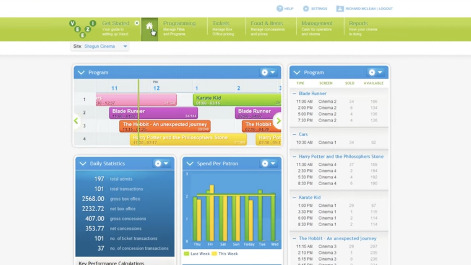
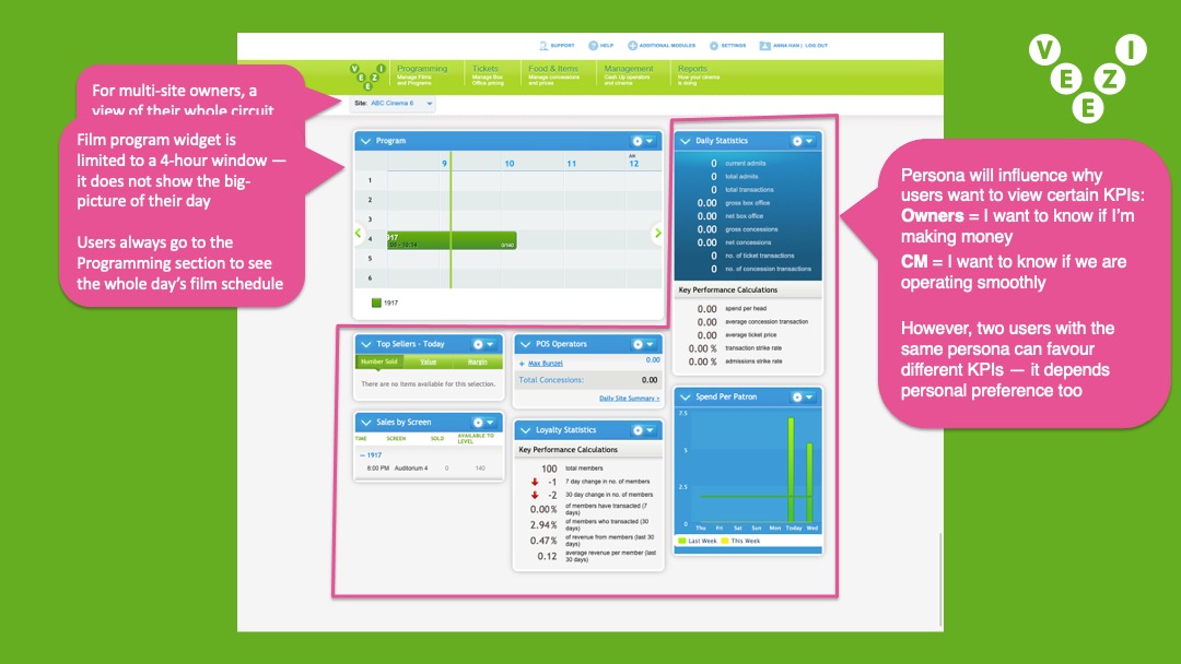
The original dashboard/landing page of Veezi’s Back Office product. It’s used by cinema managers and owners to see a holistic overview of the business’ current status.
The dashboard UI is made up of widgets, and the layout can be customised by the user.
Approach
With the Product Director supporting discovery research, and Veezi’s Business Analyst acting as my research assistant, we conducted in-depth interviews with 6 customers across New Zealand and USA (2 cinema managers and 4 cinema owners). Covid-19 lockdowns prevented us from organising more sessions.
In the lead up to the first interview, I was told many times that Veezi customers are unique. They love to be hands-on with every job of their small business, or will personally juggle multiple roles to stay operationally lean.
In the lead up to the first interview, I was told many times that Veezi customers are unique. They love to be hands-on with every job of their small business, or will personally juggle multiple roles to stay operationally lean.
One of my key research goals was validating this assumption about the owner wearing many hats. Understanding their routines would clarify how their tasks, and therefore needs, differed from the manager’s.
Insight
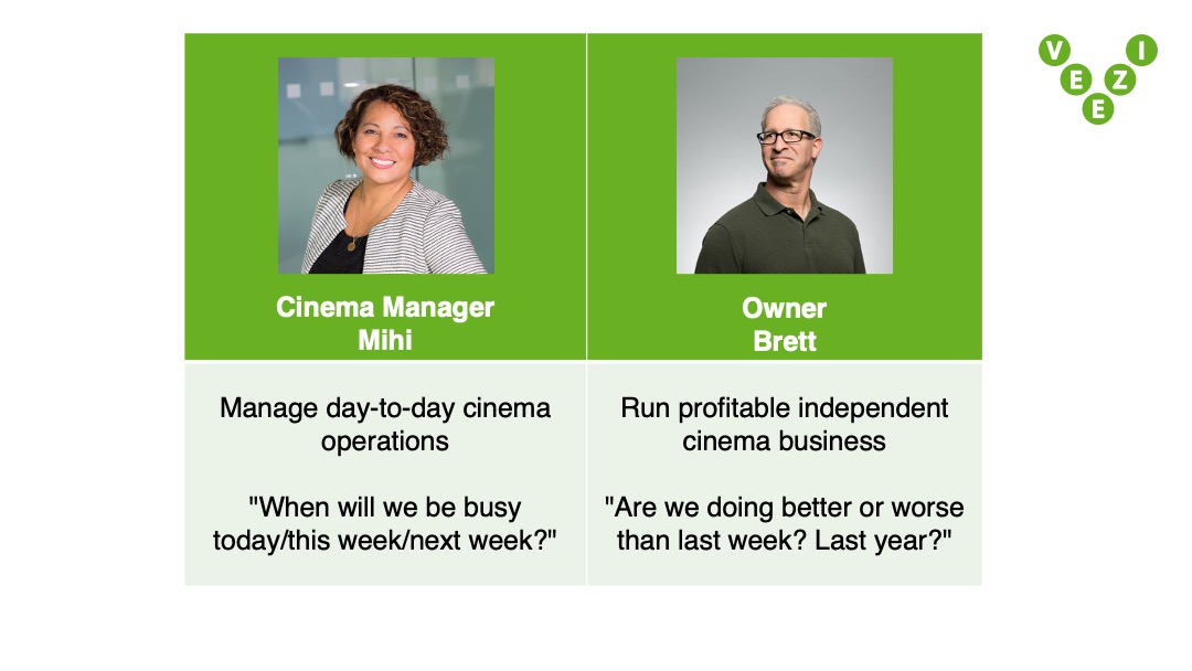
Our interview findings dispelled the myth of the restless cinema owner who did a little bit of everything, and they always employed a dedicated cinema manager. This is because these two jobs and its archetypes are distinct, therefore the data they want to see on their landing page is distinct:
- A cinema manager takes care of day-to-day operations, and need to know “When will we be busy today/this week/next week?" so they can plan their day.
- A cinema owner is concerned with running a profitable business, their landing page needs to answer “Right now, are we doing better or worse than last week? Last year?".

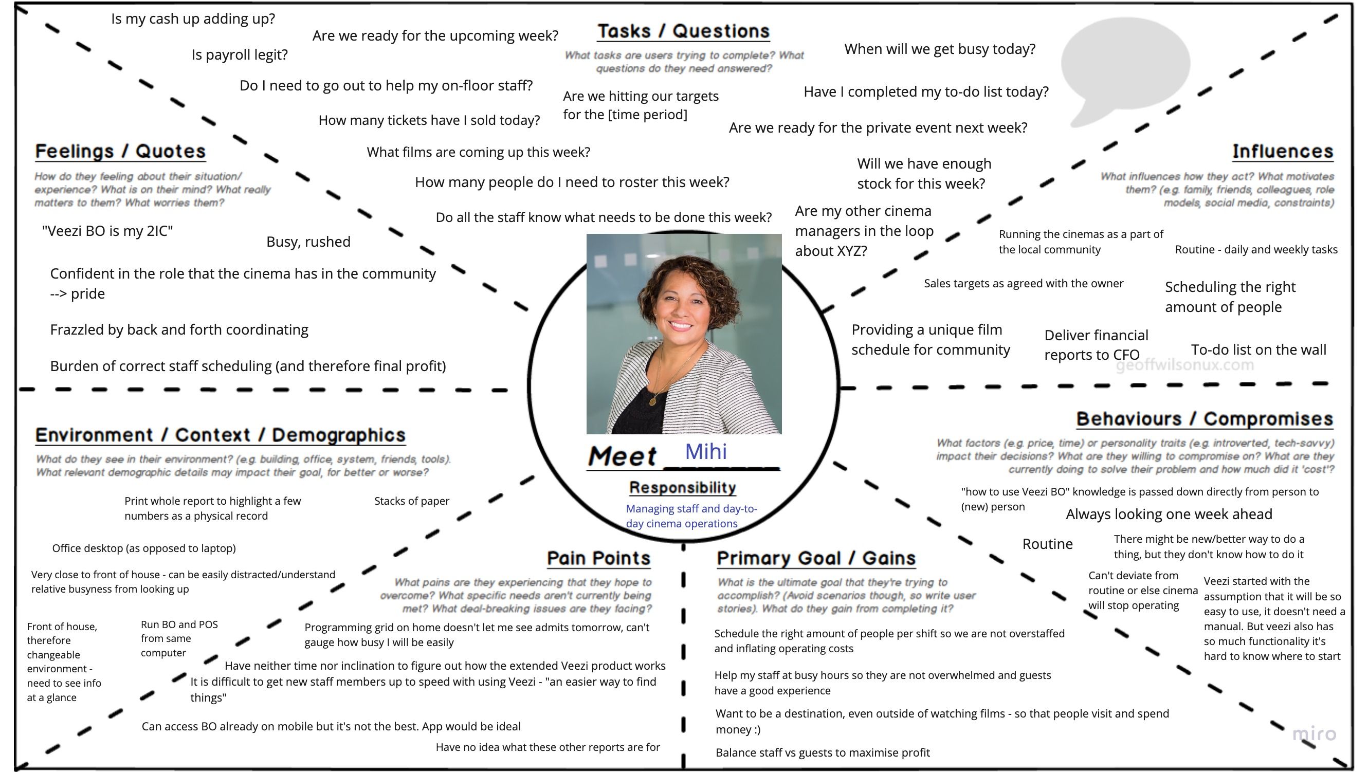
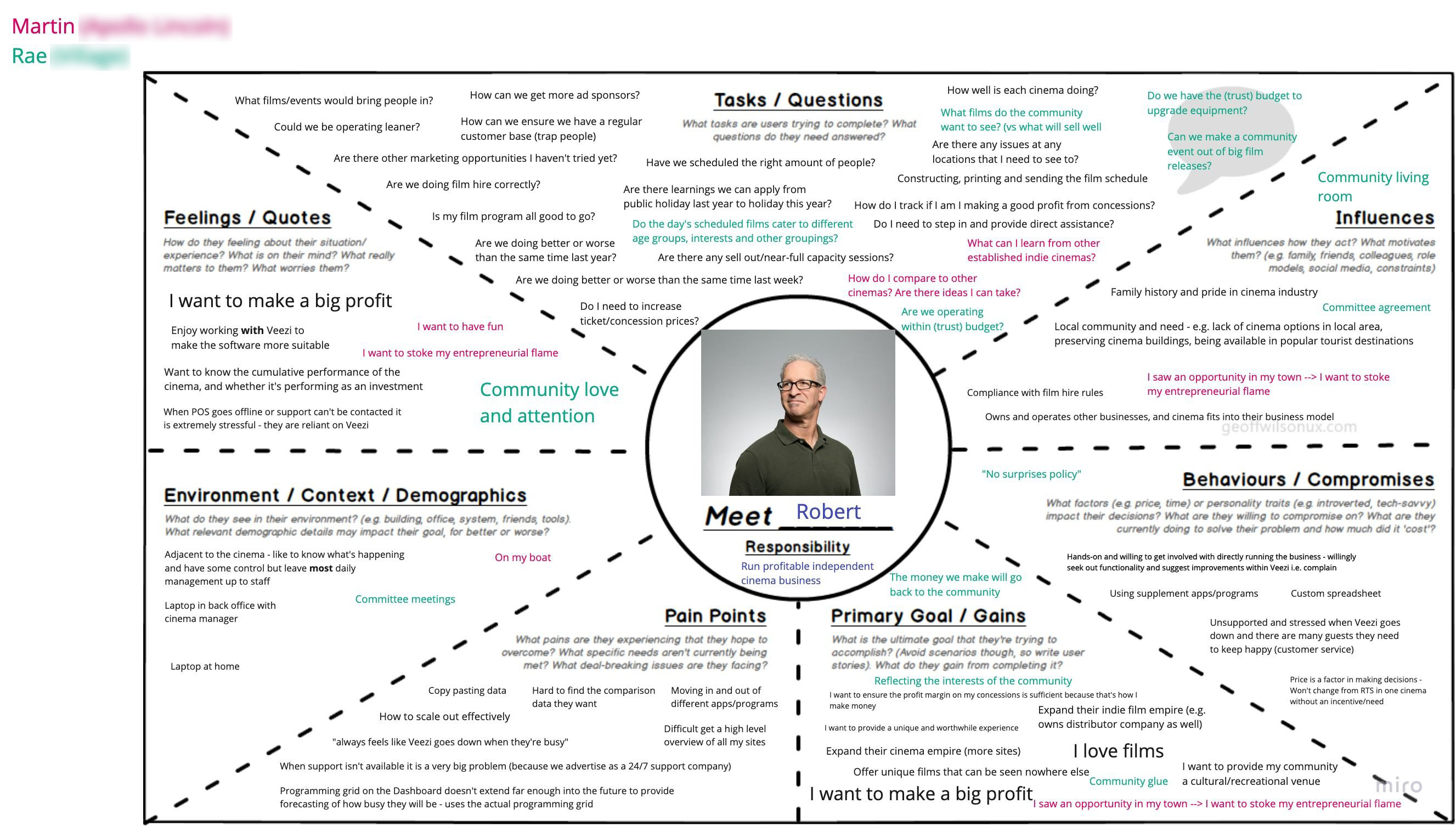
After completing our discovery round of interviews, it was clear to me the cinema manager and owner were completely different user types.
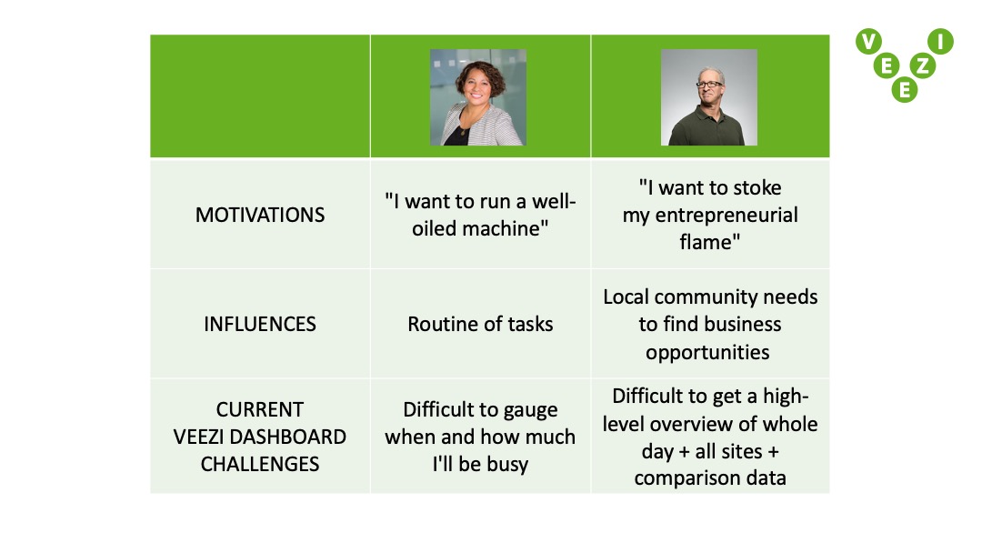
To help articulate these differences, the project’s Business Analyst (who fulfilled a research assistant role) and I filled in Persona Empathy Maps together.
Through our interviews, we also validated that dashboards were an appropriate landing interface, because both owners and managers first want to see a holistic overview of the cinema’s current status.
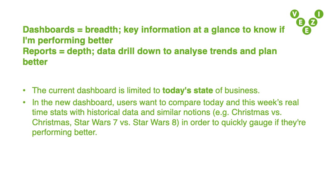
But the dashboard was still failing our users because it didn’t align with the rhythm of business. Its timeframes were generally too short, so the snapshot was never entirely helpful. For example:
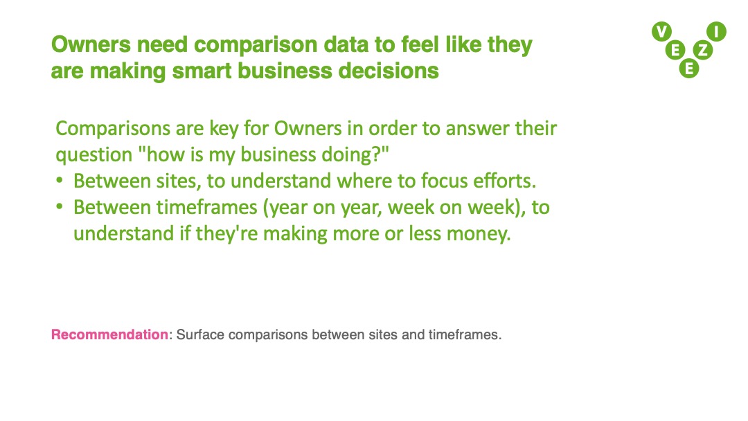
However, the biggest paintpoint — and our biggest insight — was the lack of comparision data and the miserable workaround cinema owners have developed. Comparing the business performance of identical time frames is crucial for cinema owners to understand profitability. To compensate, they were exporting files from Veezi’s Reports feature every day, and manually copy-pasting historical data into custom spreadsheets.
But the dashboard was still failing our users because it didn’t align with the rhythm of business. Its timeframes were generally too short, so the snapshot was never entirely helpful. For example:
- The KPI ticker only showed today's data, but the cinema industry operates in 1 week spans.
- The daily program was only viewable in 4 hour periods, but cinema managers need the full day’s view to understand when their rush times will be.
- It also did not automatically refresh, putting the onus of the user to keep up.
However, the biggest paintpoint — and our biggest insight — was the lack of comparision data and the miserable workaround cinema owners have developed. Comparing the business performance of identical time frames is crucial for cinema owners to understand profitability. To compensate, they were exporting files from Veezi’s Reports feature every day, and manually copy-pasting historical data into custom spreadsheets.
Because the current dashboard is essentially useless without comparisons, cinema owners were making and maintaining their own. The only users the dashboard was helping were cinema managers, but even then, not very well.
Excerpts from the Veezi dashboard insights report. Authored by myself and the Business Analyst, who acted as my research assistant.
Presented to: Veezi’s Product Director and project sponsor; Chief Product Officer and company founder; Director of Veezi in USA; Operations Manager of Veezi in USA.
Solution
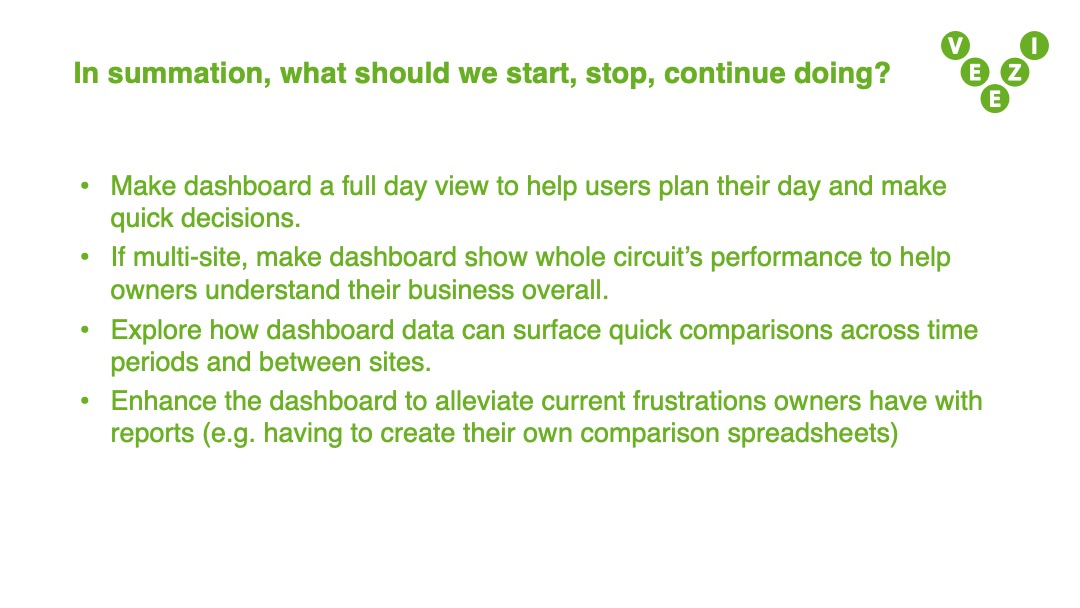
At our presentation of insights, Veezi stakeholders embraced the cinema owner as a distinct archetype. It actually offered a wonderful business opportunity for Veezi. Because this persona is now clearer it’s easier to conceive of product ideas and selling points. Together in this meeting, we agreed the current dashboard can be revised to specifically serve the cinema manager’s needs. The cinema owner needed a completely new view.
As an end-to-end designer, I can lead the user research then execute on my own insights in the UX/UI design. I iterated on both dashboards and validated my designs in follow-up interviews with 3 customers. All were relieved their key painpoints were addressed, and a further wish was expressed: more visual and graphical representations of performance over time.
As an end-to-end designer, I can lead the user research then execute on my own insights in the UX/UI design. I iterated on both dashboards and validated my designs in follow-up interviews with 3 customers. All were relieved their key painpoints were addressed, and a further wish was expressed: more visual and graphical representations of performance over time.
If I’d successfully redesigned a bare minimum dashboard, how should I treat the visualisations to uplift the stakes to a lovable dashboard?
Reflection
This question of a lovable Veezi dashboard is yet to be answered. Further iterating, testing, and development halted when Covid-19 reprioritised Veezi’s projects to ones that might more immediately alleviate our customers.
This project was an unexpected learning of how a single global event can instantly recalibrate entire industries. If the disruption continues for years, social norms will change so much that big problems can be rendered irrelevant. We can try to catch the wave at the right moment, but sometimes it completely knocks you off, and never returns.
This project was an unexpected learning of how a single global event can instantly recalibrate entire industries. If the disruption continues for years, social norms will change so much that big problems can be rendered irrelevant. We can try to catch the wave at the right moment, but sometimes it completely knocks you off, and never returns.

