How do you lead an online conference that’s under-resourced and paid $0?
Achievements
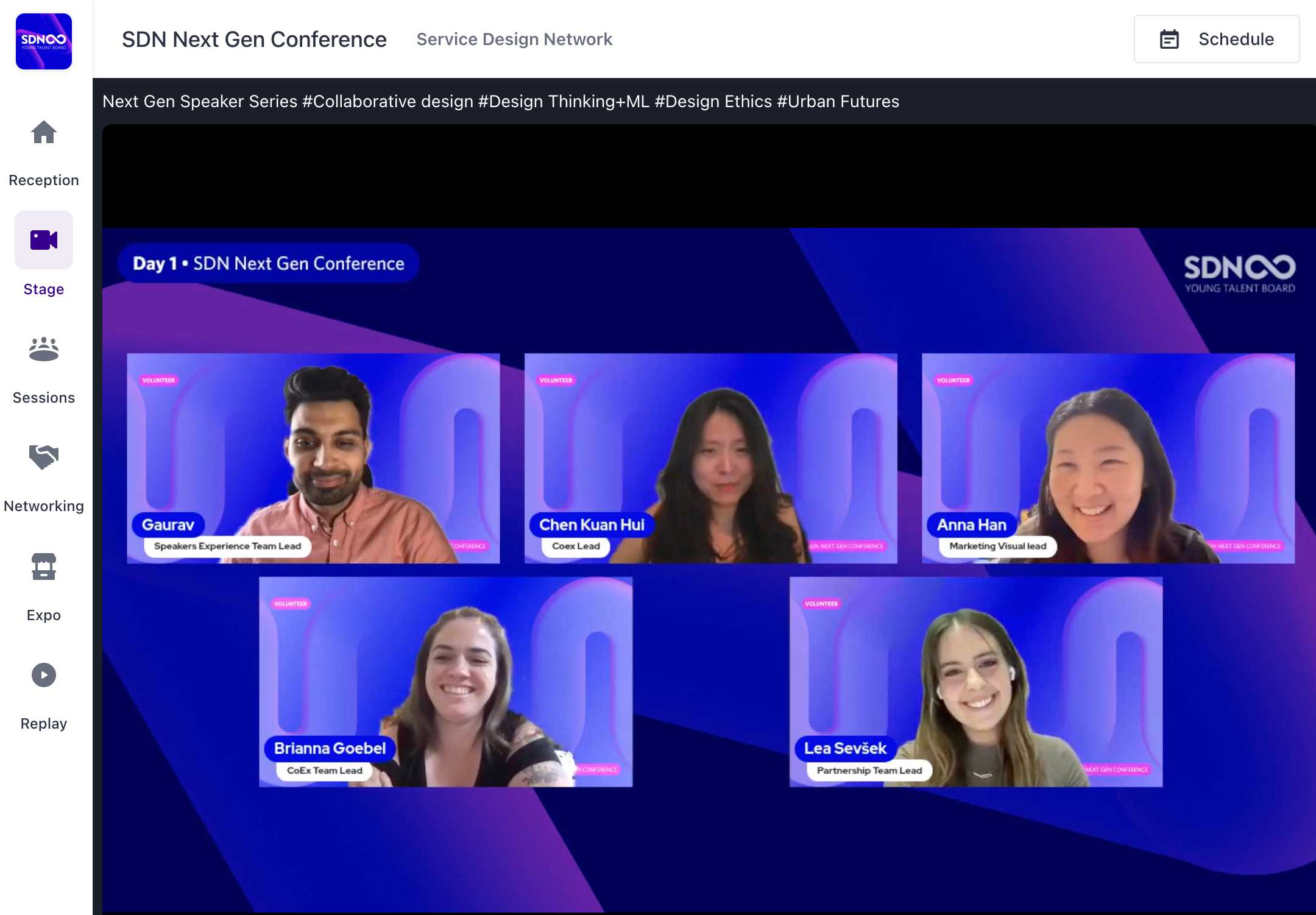
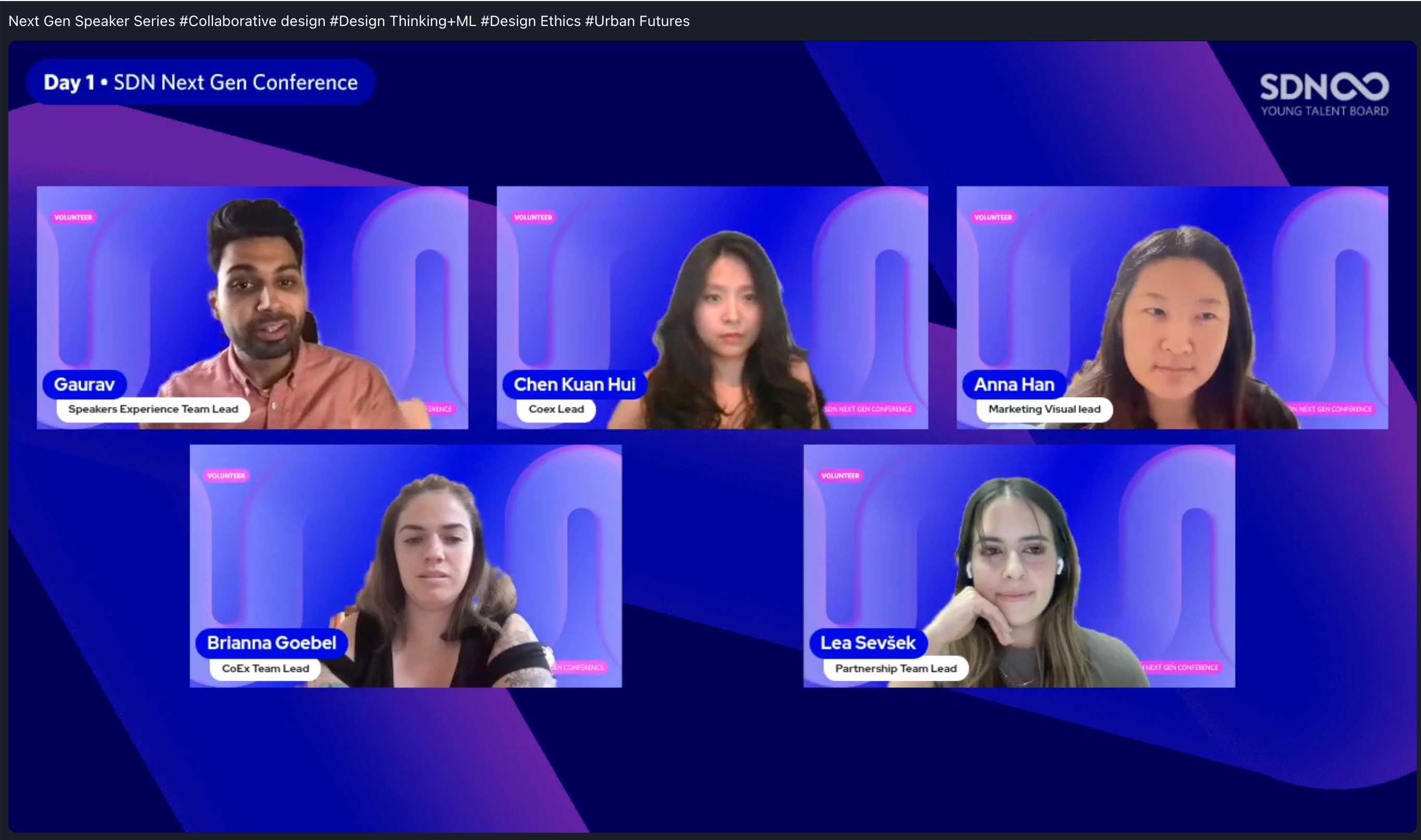
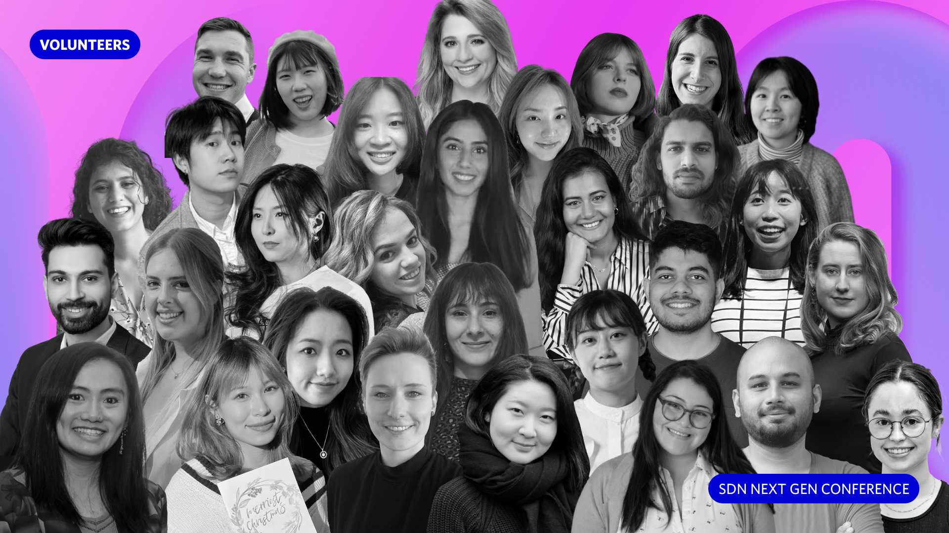
SDN Next Gen Conference’s two day online event attracted more than 300 registrants from over 40 countries, and scored a 9.2/10 rating.
As the Marketing and Visual team lead of 7, in 6 months we increased SDN Young Talent Board’s LinkedIn and Instagram followers by around 80%:
︎ 84% increase (929 ︎︎︎ 1710 followers)
︎ 77% increase (495 ︎︎︎ 877 followers)
As the Marketing and Visual team lead of 7, in 6 months we increased SDN Young Talent Board’s LinkedIn and Instagram followers by around 80%:
︎ 84% increase (929 ︎︎︎ 1710 followers)
︎ 77% increase (495 ︎︎︎ 877 followers)
Summary
COMPANY
The Service Design Network Young Talent Board (Remote)
SECTOR
Service design; Event design; Volunteering
DURATION
6 months, 2023
The Service Design Network Young Talent Board (Remote)
SECTOR
Service design; Event design; Volunteering
DURATION
6 months, 2023
RESPONSIBILITIES
Team leadership, People alignment, Global collaboration, Project management, Workshop design
CONTRIBUTORS
Marketing and Visual volunteer team of 7, SDN Next Gen Conference 2023 volunteers, The Service Design Network’s Head of Marketing
View the SDN Next Gen Conference 2023 website︎︎︎
Experience the accompanying Metaverse︎︎︎
Play in our Afterparty Metaverse︎︎︎
Objective
The Service Design Network Young Talent Board (SDN Young Talent Board, or YTB) is a new initiative from The Service Design Network (SDN) founded in 2022. It was formed to bridge the gap between education and professional practice, and create a more diverse and equitable service design industry.
Through its own annual online event called SDN Next Gen Conference, YTB strives to nurture a vibrant, global community of service design students, young professionals, and career changers. The conference is entirely volunteer driven, each edition created in 6 months, by a team of students or designers with less than 5 years of service design industry experience.
I joined the sophomore SDN Next Gen Conference 2023 as the Marketing and Visual team lead. This team is responsible for the conference’s look and feel, content creation, conference brand narrative, promotional strategy, and social media channels management. By this point I had 3 years of UX Auckland community organising experience, managing their Instagram account, visual content creation, event photography, and general monthly event planning.
It was because of this background I knew I had the right skills to offer YTB and their conference. I also wanted to practice leadership in a fun setting, in a design discipline I care about.


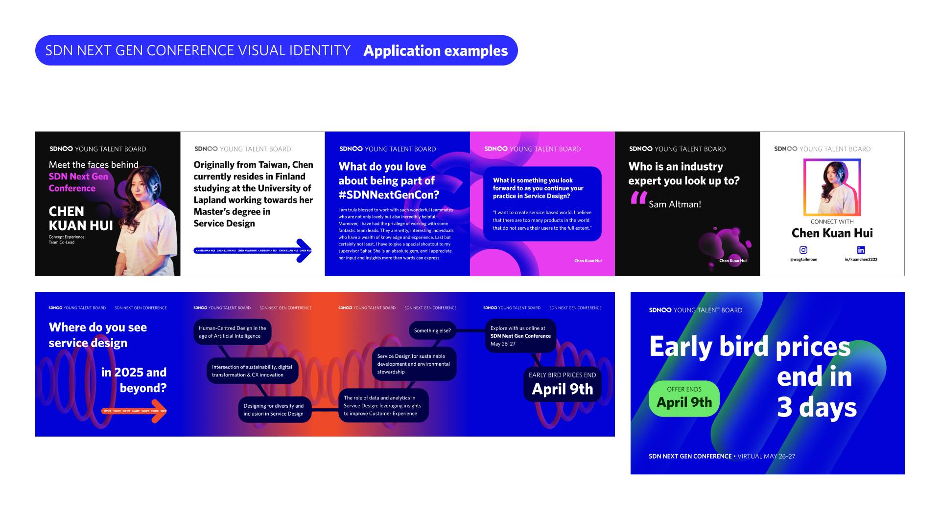
Excerpts from the SDN Next Gen Conference 2023 brand guidelines. Because the conference theme was future-facing, “Beyond Service Design in 2025”, the visual identity needed to reflect that. Although we explored exciting, illustration-based narratives too, the final concept still needed to be easy and quick to execute day-to-day. The concept was co-created by the Marketing and Visual team through multiple workshops.
Approach
Though earmarked to start with 5 volunteers, only 1 joined my team at kickoff! To prepare for new recruits, I crafted a welcome email pack and always commenced their volunteering with a one-on-one walkthrough call. As volunteers joining mid-flight, their first challenge would be catching up on knowledge gaps. Although personal onboarding is extra admin and time, I believed it’d greatly enable an enjoyable volunteer experience.
My Marketing and Visual team eventually grew to 7, a truly global crew located across 5 unique timezones. To compensate for the time differences I relied on polls/voting, weekly meetings on alternating days/times, meeting text summaries, and asynchronous over-communication.
I quickly learned it’s best to start using a project management tool ASAP. For my team, I found a Trello-type tool worked best because of its simple usage that’s still easy to overview.
I encouraged everyone to work smarter through AI tools: ChatGPT was great for synthesising long notes and generating social media captions, but Caption Spark was better for unique hashtags. Descript is a straightforward video editor, and DALL-E could generate specific images.
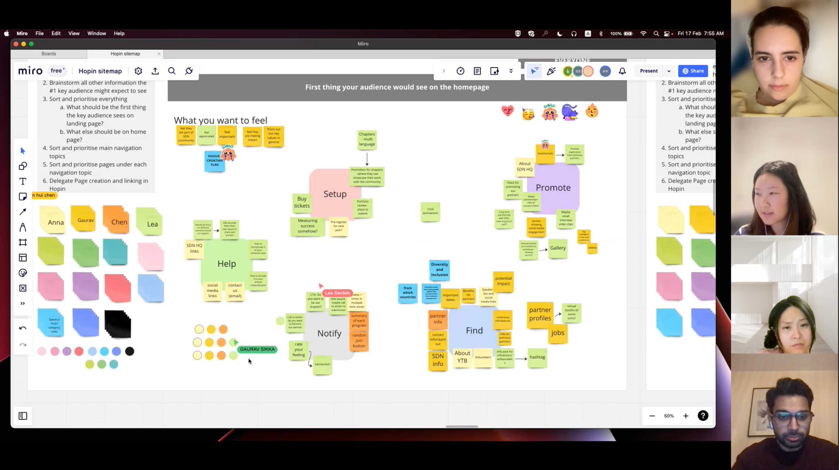
Through proactive and frequent communication, regular meetings, and appropriate workshops, my team co-created the creative direction of SDN Next Gen Conference 2023. We continued to complete tasks and collaborate with other teams, in an endurance marathon until the conference D-Day (May 26–27, 2023).
My Marketing and Visual team eventually grew to 7, a truly global crew located across 5 unique timezones. To compensate for the time differences I relied on polls/voting, weekly meetings on alternating days/times, meeting text summaries, and asynchronous over-communication.
I already knew it’s crucial to over-communicate when working remotely using asynchronous tools, in order to be perceived as typically communicative
I quickly learned it’s best to start using a project management tool ASAP. For my team, I found a Trello-type tool worked best because of its simple usage that’s still easy to overview.
I encouraged everyone to work smarter through AI tools: ChatGPT was great for synthesising long notes and generating social media captions, but Caption Spark was better for unique hashtags. Descript is a straightforward video editor, and DALL-E could generate specific images.
Through proactive and frequent communication, regular meetings, and appropriate workshops, my team co-created the creative direction of SDN Next Gen Conference 2023. We continued to complete tasks and collaborate with other teams, in an endurance marathon until the conference D-Day (May 26–27, 2023).
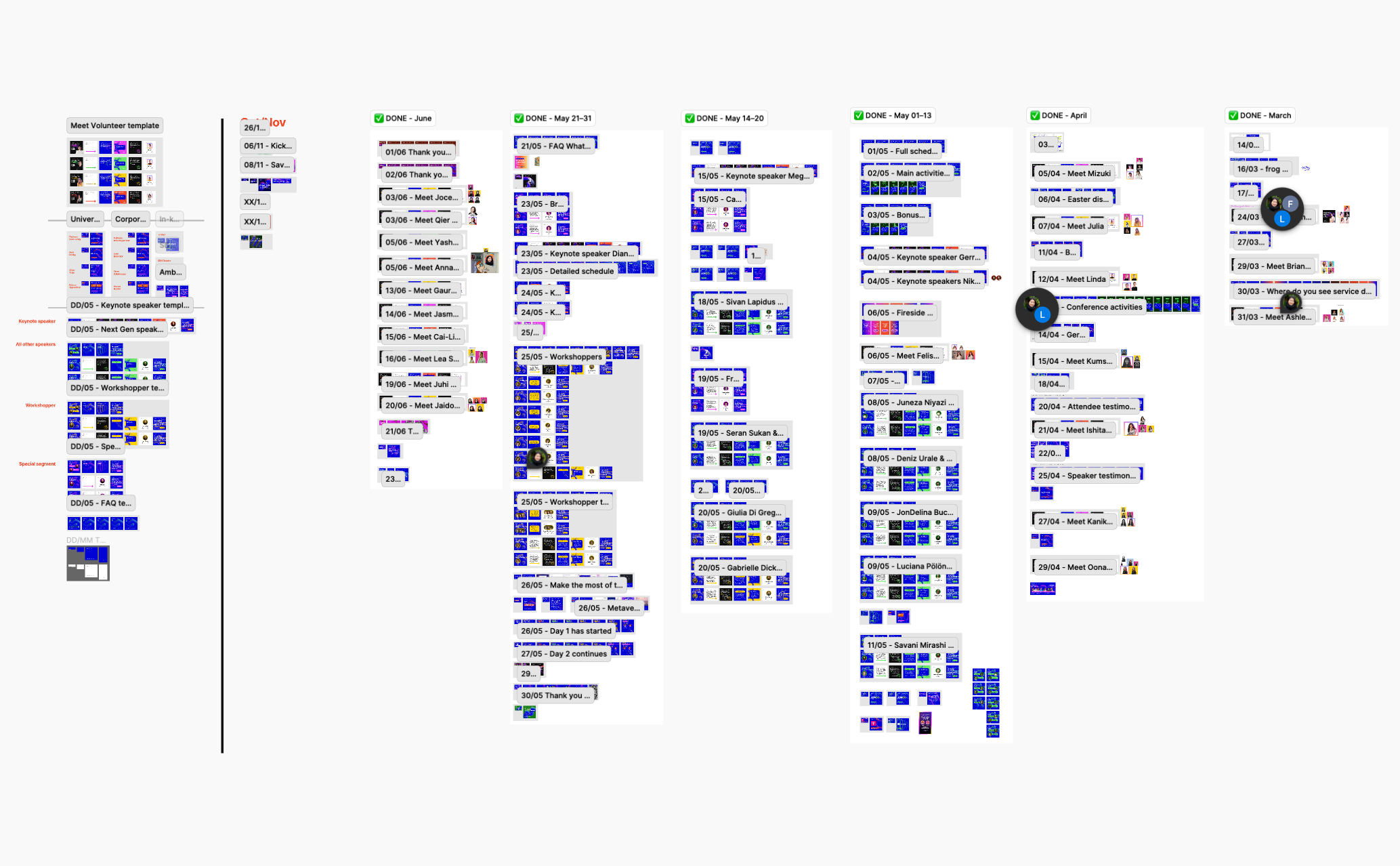
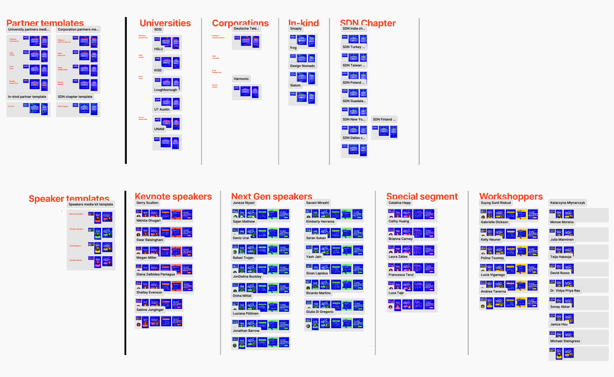
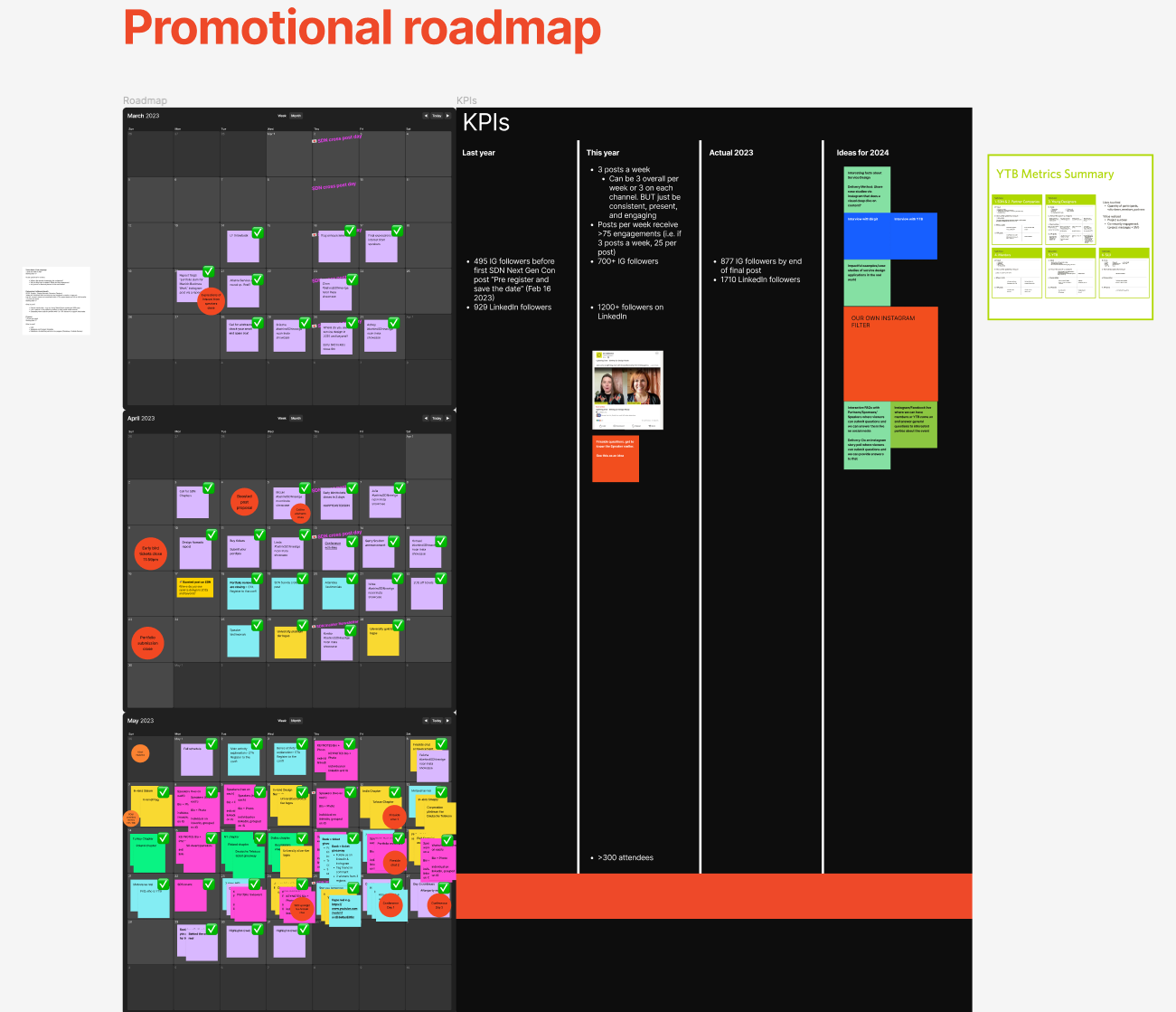
Pages from the Marketing and Visual team's Figma file. Designing was delegated to my team members. I would quality check and complete tasks my members didn’t have capacity to finish.
Insight
In my 6 months of volunteering, my key learnings about leadership can be summaried in 6 principles:
- Make your own rules, but co-create and collaborate for everything, including prioritisation
There’s really no rules for how to do anything, just make it up! The tool or method doesn’t matter; do what needs to be done to keep people moving forward. The only caveat being collaboration is faster in the end because everyone gets informed at the same time, which is perfect for a remotely working global team. This does not mean you must wait for everyone’s schedules to align. Simply offer the best time and space, arrange for asynchronous participation, and inform “If you don't attend, your perspective won't be included”.
- Rather than planning exhaustively, it’s better to be agile
Life will happen; expect the unexpected. It’s more important a team is flexible and ready to pivot instantly. Some scenarios:
- Slacking volunteers, ghosting volunteers, not enough volunteers
- Not enough ticket sales, not enough speakers, not enough of anything
- Simultaneous sickness, simultaneous exams, simultaneous life events
- Implement learnings right away
Related to Principle #2: because I was orchestrating my team to be flexible, I was giving myself the permission to lead flexibly too. I reflected on what to start, stop, and continue doing at every turn of the project, effectively iterating on my own leadership style. Documenting my learnings and suggestions for next year cleared my head. Mentors who supported me through my leadership journey is SDN’s Head of Marketing Judee Bendiola, and YTB co-founder Jaidon Lalor.
- It’s ok to fire people
In a volunteer setting it’s easy to put up with bad behaviour or dead weight because we’re thankful people are volunteering at all. But that commitment they’ve pledged may also be why some people can’t assess their situation sensibly and resign.
- Clear, even harsh, delineation of priorities for each member
Volunteering is accomplished through the goodness of each person’s free time. To respect this sacrifice, it’s essential to define what each member will and will not work on. I think the best way to do this is yet again, co-creation. If each member defines their own role, their priorities, their relation to other roles, and their relation to other teams, they know their boundaries through-and-through. The intention with this is no one will get too eager and help out in non-priority areas, and feel like they wasted time. It’s then the team lead’s job (me) to divert people to miscellaneous P1 tasks as they arise.
- Protect your team, embrace your fellows
A vital part of being a lead is shielding your team from unnecessary pressure and work. I’ve learned to block demanding requests by highlighting incomplete information, and communicating both factual and emotional consequences of such demands. However, most helpful was escalating my concerns early and pushing for action together, now. Once again, the best way forward is collaboration.
But most importantly, always remember we are volunteers, and volunteering should be fun. It’s fun to work together with peers who have the same goals as you. So remind everyone not to freak out, just do what you can with the time that you have.
Have fun, complain liberally, and let the hard times bring people together



Solution
While still working full time, I volunteered as the lead of the Marketing and Visual team for SDN Next Gen Conference 2023.
Through collaboration, flexibility, and constant reflection, I iterated on my leadership skills and felt myself grow continuously. I now have the confidence and proof I can handle any project.
The two day online event attracted more than 300 registrants from over 40 countries, and scored a 9.2/10 rating.
In the 6 months’ lead-up to the conference, my team of 7 increased YTB’s LinkedIn and Instagram followers by around 80%:
︎ 84% increase (929 ︎︎︎ 1710 followers)
︎ 77% increase (495 ︎︎︎ 877 followers)
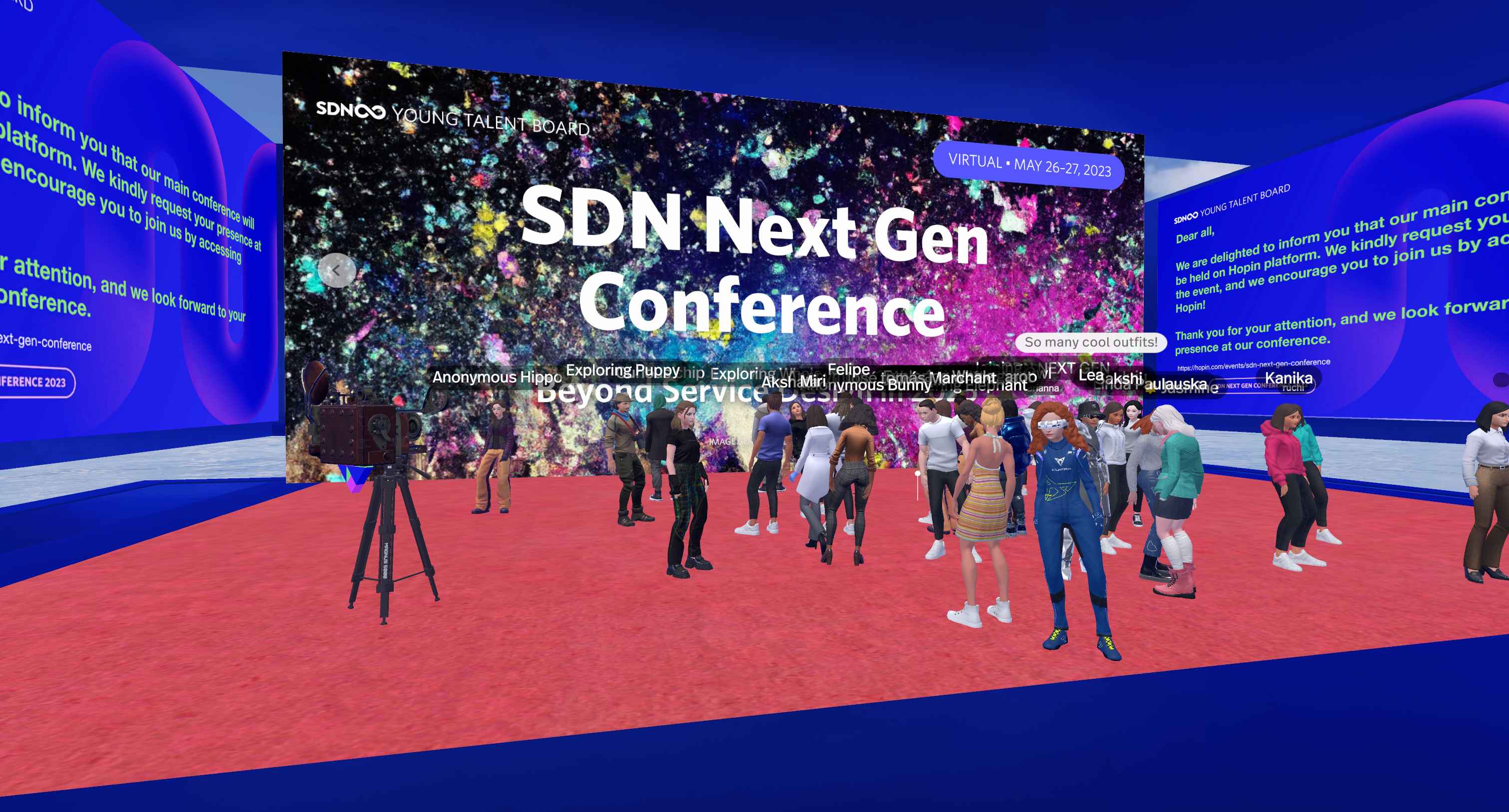
We went all in on our future-facing conference theme and created two metaverses for attendees. This second one was designed as a wild afterparty venue.

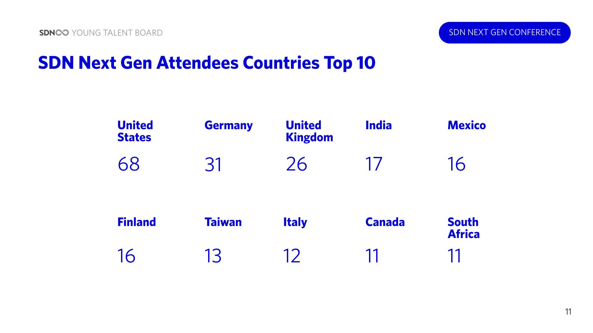
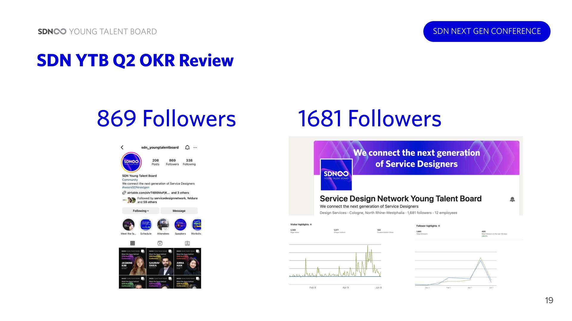
Excerpts from the Evaluation Report, authored by the 4 YTB co-founders. The report was written before the final social media post was published, so the followers count for both LinkedIn and Instagram is presented as lower than the actual final number.
From 16.02.2023–23.06.2023:
︎ 84% increase (929 ︎︎︎ 1710 followers)
︎ 77% increase (495 ︎︎︎ 877 followers)
Reflection
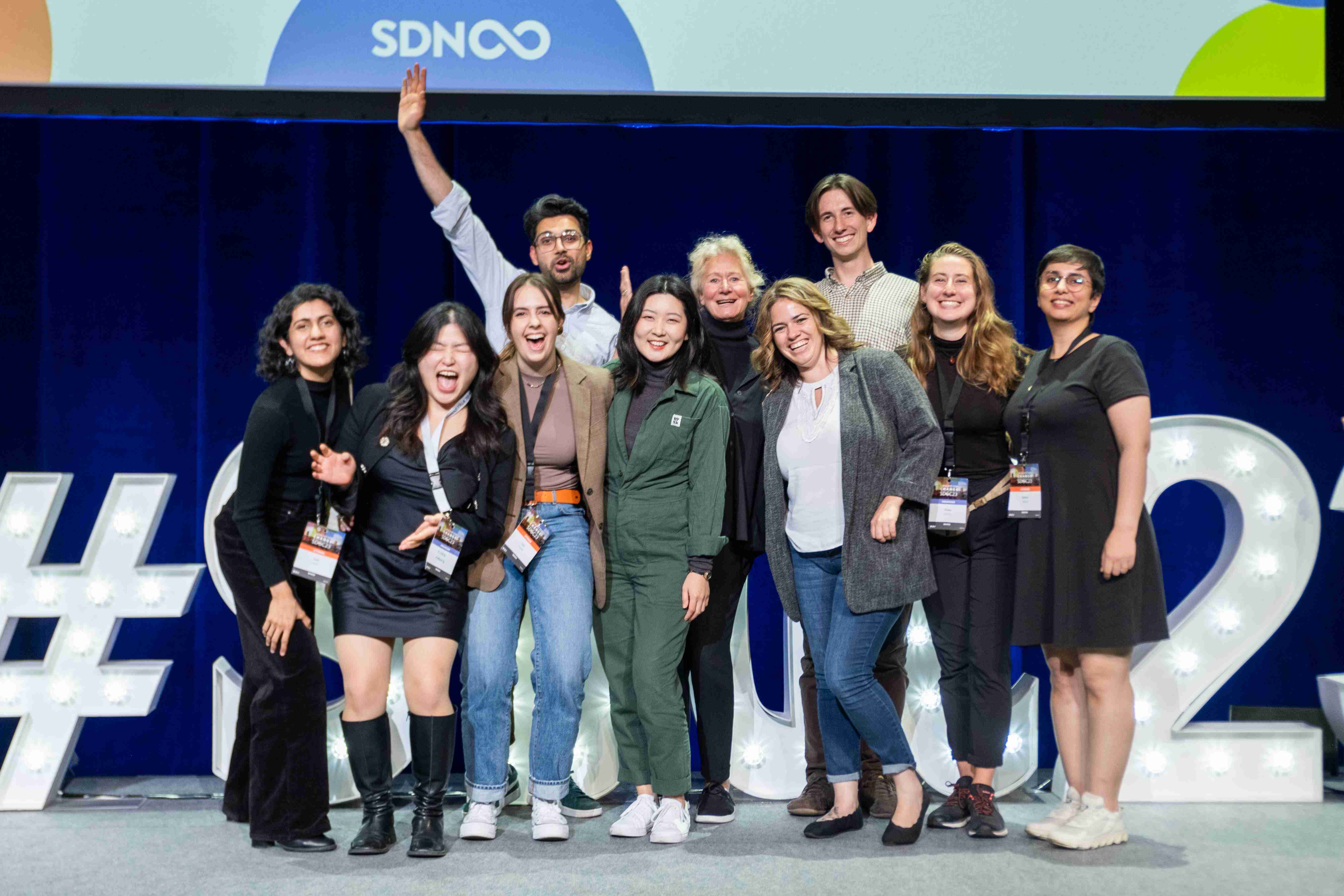
After SDN Next Gen Conference 2023 finished, my fellow team leads and I were invited to attend the Service Design Global Conference in Berlin by SDN president, Birgit Mager. I took this as my sign to move abroad, from New Zealand at the bottom of the world, to Germany in the heart of Europe. I met in-person all the characters I’d only knew as faces on my screen: my team lead peers, YTB co-founders, and SDN mentors.
Soon after, two of the four YTB co-founders departed. Another team lead and I were invited as permanent SDN Young Talent Board members. I now mentor my conference Marketing and Visual team lead successors, improve the volunteer experience for future cohorts, and lead YTB’s other projects. What started as a fun personal challenge turned into a life-changing opportunity.
Lou Downe is infamous for saying “Service design is 10% design, 90% creating the conditions for design to happen”. I believe this is applicable to any industry, in any organisation: a good leader’s responsibility is people alignment, collaboration, priorities influencing through proactive communication, and conversation facilitation (i.e. workshop design) in order to unblock work streams.
View the SDN Next Gen Conference 2023 website︎︎︎
Experience the accompanying Metaverse︎︎︎
Play in our Afterparty Metaverse︎︎︎
![Standing on the middle of the Service Design Global Conference 2023 stage is me. Surrounded by my fellow SDN Next Gen Conference 2023 team leads, president of SDN (Birgit Mager), and co-founders of YTB.]()
Soon after, two of the four YTB co-founders departed. Another team lead and I were invited as permanent SDN Young Talent Board members. I now mentor my conference Marketing and Visual team lead successors, improve the volunteer experience for future cohorts, and lead YTB’s other projects. What started as a fun personal challenge turned into a life-changing opportunity.
Lou Downe is infamous for saying “Service design is 10% design, 90% creating the conditions for design to happen”. I believe this is applicable to any industry, in any organisation: a good leader’s responsibility is people alignment, collaboration, priorities influencing through proactive communication, and conversation facilitation (i.e. workshop design) in order to unblock work streams.
A good leader does 10% work, 90% creating the conditions for others to do good work
View the SDN Next Gen Conference 2023 website︎︎︎
Experience the accompanying Metaverse︎︎︎
Play in our Afterparty Metaverse︎︎︎
How do you reassure Netflix about their new cinema venture?
Do the work. Deliver on-time and within budget to inspire confidence for a positive long-term relationship

Summary
RESPONSIBILITIES
Responsive web UI design, Stakeholder management
CONTRIBUTORS
Vista Entertainment Solutions: Director of Digital Delivery, Head of Design
View the Paris Theater website︎︎︎
Responsive web UI design, Stakeholder management
CONTRIBUTORS
Vista Entertainment Solutions: Director of Digital Delivery, Head of Design
View the Paris Theater website︎︎︎
Objective
Netflix dipped their toes into the cinema industry with their lease of the iconic Paris Theater, and invested in and completed a website redesign. But barely a year later, Netflix realised it needed to differentiate Paris’ brand positioning from other single-screen cinemas in New York — less indie, more premium; the destination for prestige film screenings.
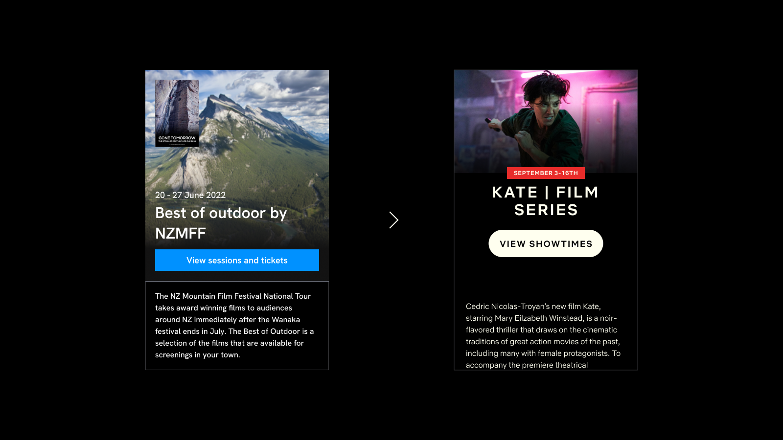
Netflix provided a single design for a reimagined desktop home screen and explained their concept. The only catch was their budget was extremely tight.
Netflix provided a single design for a reimagined desktop home screen and explained their concept. The only catch was their budget was extremely tight.

Paris Theater’s original website was actually the result of its first redesign after signing a lease with Netflix. A year later, Netflix realised it needed to differentiate Paris’ brand positioning from other indie cinemas in New York. Their new vision for Paris was a premium destination for prestige film screenings.
Approach
Tight budget means tight timeline. Together with my Director of Digital Delivery, we determined a 2 design sprint schedule (4 weeks) was sufficient to translate Netflix’s home screen concept to the rest of their website, in desktop and mobile. We were to present progress to Netflix and Paris Theater stakeholders every 2 weeks (2 meetings total). The reskinning of Paris Theater’s UI was admittedly straightforward.
However, our existing ‘Omni-Channel Components’ and features were designed with multi-site chains in mind, not for single-screen independent cinemas. It was also crucial that film programming and website content management remained in Paris Theater’s domain; a fully flexible CMS took priority over UX quick wins. These factors meant absolutely no new back-end development.
However, our existing ‘Omni-Channel Components’ and features were designed with multi-site chains in mind, not for single-screen independent cinemas. It was also crucial that film programming and website content management remained in Paris Theater’s domain; a fully flexible CMS took priority over UX quick wins. These factors meant absolutely no new back-end development.
So instead, we cleverly reused and bundled components that, although were never intended to be used as such, still achieved the outcome Paris Theater were wanting


Insight
I reviewed design progress every week with my project colleagues in the UK, and presented every 2 weeks to heavyweight Netflix and Paris Theater stakeholders: Brand Design Lead, Global Brand Design Manager, Head of Distribution, Digital Producer, Manager of Theatrical Programming. One could wonder why such important people were attending website reskinning meetings. Perhaps this level of care is how they treat all projects? Certainly it reflected how important the project was to them.
My take, however, is because Netflix were nervous: their budget was small and we were new vendors. Cinema itself is also a new venture for Netflix, who are pioneers of digital content streaming, and not physical film experiences.
My take, however, is because Netflix were nervous: their budget was small and we were new vendors. Cinema itself is also a new venture for Netflix, who are pioneers of digital content streaming, and not physical film experiences.
The success of this simple website redesign project was surely Netflix’s litmus test for the success of their cinema gamble
Solution
As a small UX/UI Design team serving 20+ B2B products, anyone who contributes to a project pitches in to maintain, update, and improve the respective Figma library file. 2 designers and I (out of a team of 6) were the main authors of our digital “Omni-Channel Components” library. Thanks to our diligent upkeep, it was incredibly easy to adjust the Figma components to Paris Theater’s styling.
![Example of our white-label “Omni-Channel Components" easily adjusted to suit the client's branding. There is no additional business logic, it is simply front-end restyling. These two are the same “Film Header" in desktop view, which is fully responsive too.]()
![]()
![Overview of our Figma library file used for client work. Reusing these Figma components were the starting point of reskinning work.]()
![Updated style guide of Paris Theater's rebranded website, for front-end developers to reference]()
Each stakeholder meeting was productive: Netflix had minimal suggestions, and Paris Theater were confident they could maintain the content management system. We delivered on our promise and launched the redesigned website on-time and within budget.



Each stakeholder meeting was productive: Netflix had minimal suggestions, and Paris Theater were confident they could maintain the content management system. We delivered on our promise and launched the redesigned website on-time and within budget.
Reflection
Sometimes the best way to impress a client is to be insignificant — don’t cause stress, don’t makes waves.
I have no doubts this project directly resulted in another collaboration a year later: the kiosk and web ticketing of Netflix’s newly acquired Egyptian Theatre.
View the refreshed Paris Theater website︎︎︎
To reassure a new client of your trustworthiness and ability to deliver, put your head down and do the work they’ve asked for, exactly as they’ve asked for
I have no doubts this project directly resulted in another collaboration a year later: the kiosk and web ticketing of Netflix’s newly acquired Egyptian Theatre.
View the refreshed Paris Theater website︎︎︎


Don’t independent cinema owners do a little bit of everything?
Even at a small business, each role and their needs are clear-cut: the owner focuses on profit year-over-year, the manager focuses on operations day-to-day

Summary
RESPONSIBILITIES
User research, UX design, UI design
CONTRIBUTORS
Business Analyst, Head of Design, Product Director
User research, UX design, UI design
CONTRIBUTORS
Business Analyst, Head of Design, Product Director
Objective
Veezi is a web-based management tool for independent cinemas. Its Back Office product is used by managers and the owner for cinema operations administration, such as stocktaking, cashing up, film programming, ticket pricing, and report exporting. The landing page is a dashboard.
Before committing to some suggested improvements to the dashboard, the Product Director wanted to do “proper research" on the needs of a landing page as a whole. Should it even be a dashboard? What information do Veezi users want to see?
Before committing to some suggested improvements to the dashboard, the Product Director wanted to do “proper research" on the needs of a landing page as a whole. Should it even be a dashboard? What information do Veezi users want to see?
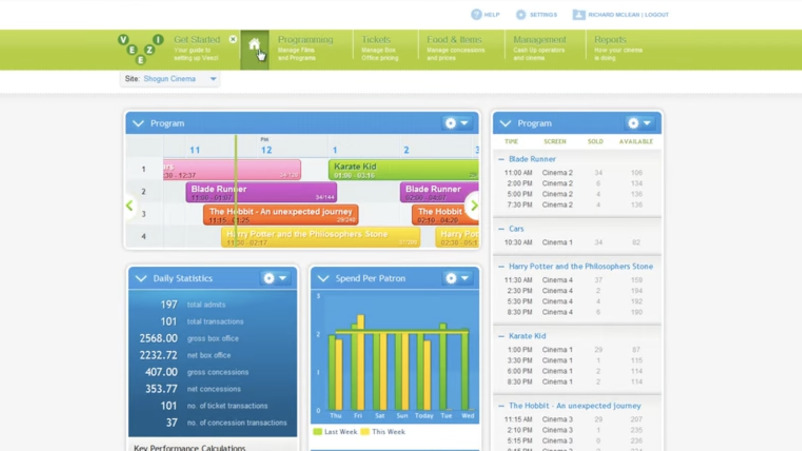
The original dashboard/landing page of Veezi’s Back Office product. It’s used by cinema managers and owners to see a holistic overview of the business’ current status.
The dashboard UI is made up of widgets, and the layout can be customised by the user.
Approach
With the Product Director supporting discovery research, and Veezi’s Business Analyst acting as my research assistant, we conducted in-depth interviews with 6 customers across New Zealand and USA (2 cinema managers and 4 cinema owners). Covid-19 lockdowns prevented us from organising more sessions.
In the lead up to the first interview, I was told many times that Veezi customers are unique. They love to be hands-on with every job of their small business, or will personally juggle multiple roles to stay operationally lean.
In the lead up to the first interview, I was told many times that Veezi customers are unique. They love to be hands-on with every job of their small business, or will personally juggle multiple roles to stay operationally lean.
One of my key research goals was validating this assumption about the owner wearing many hats. Understanding their routines would clarify how their tasks, and therefore needs, differed from the manager’s.
Insight
Our interview findings dispelled the myth of the restless cinema owner who did a little bit of everything, and they always employed a dedicated cinema manager. This is because these two jobs and its archetypes are distinct, therefore the data they want to see on their landing page is distinct:
- A cinema manager takes care of day-to-day operations, and need to know “When will we be busy today/this week/next week?" so they can plan their day.
- A cinema owner is concerned with running a profitable business, their landing page needs to answer “Right now, are we doing better or worse than last week? Last year?".

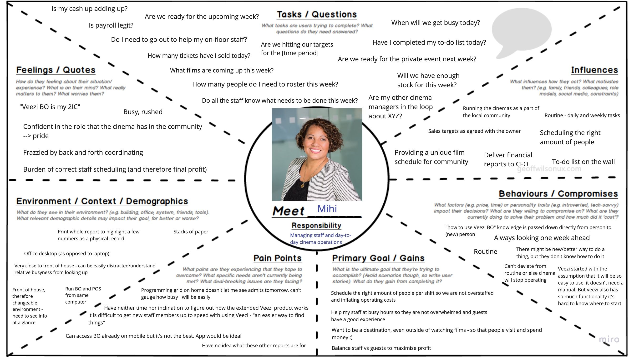
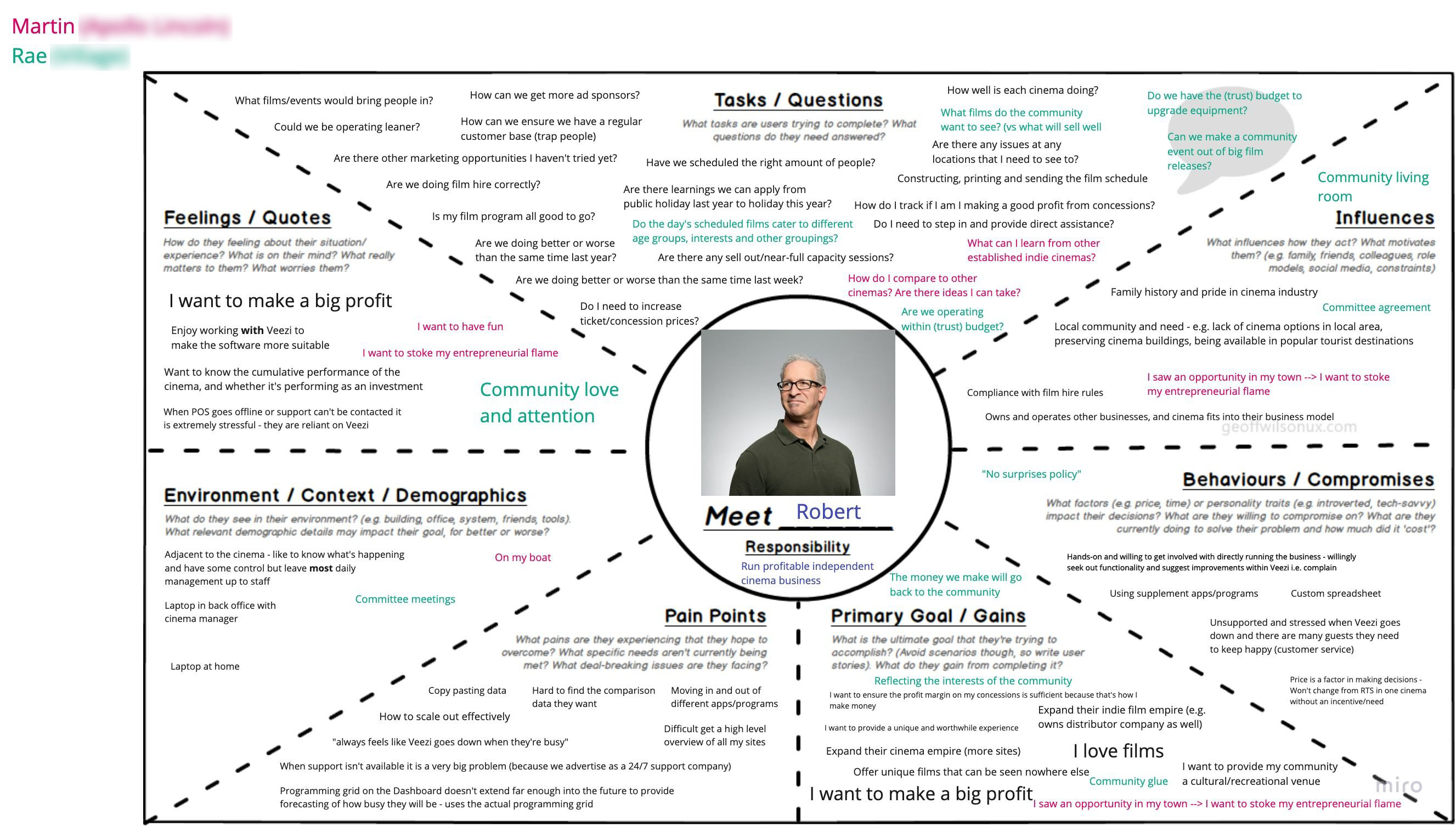
After completing our discovery round of interviews, it was clear to me the cinema manager and owner were completely different user types.
To help articulate these differences, the project’s Business Analyst (who fulfilled a research assistant role) and I filled in Persona Empathy Maps together.
Through our interviews, we also validated that dashboards were an appropriate landing interface, because both owners and managers first want to see a holistic overview of the cinema’s current status.
But the dashboard was still failing our users because it didn’t align with the rhythm of business. Its timeframes were generally too short, so the snapshot was never entirely helpful. For example:
However, the biggest paintpoint — and our biggest insight — was the lack of comparision data and the miserable workaround cinema owners have developed. Comparing the business performance of identical time frames is crucial for cinema owners to understand profitability. To compensate, they were exporting files from Veezi’s Reports feature every day, and manually copy-pasting historical data into custom spreadsheets.
But the dashboard was still failing our users because it didn’t align with the rhythm of business. Its timeframes were generally too short, so the snapshot was never entirely helpful. For example:
- The KPI ticker only showed today's data, but the cinema industry operates in 1 week spans.
- The daily program was only viewable in 4 hour periods, but cinema managers need the full day’s view to understand when their rush times will be.
- It also did not automatically refresh, putting the onus of the user to keep up.
However, the biggest paintpoint — and our biggest insight — was the lack of comparision data and the miserable workaround cinema owners have developed. Comparing the business performance of identical time frames is crucial for cinema owners to understand profitability. To compensate, they were exporting files from Veezi’s Reports feature every day, and manually copy-pasting historical data into custom spreadsheets.
Because the current dashboard is essentially useless without comparisons, cinema owners were making and maintaining their own. The only users the dashboard was helping were cinema managers, but even then, not very well.
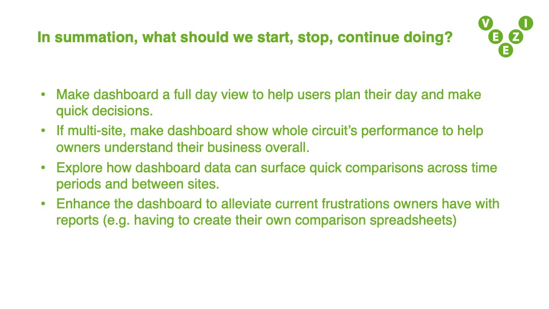
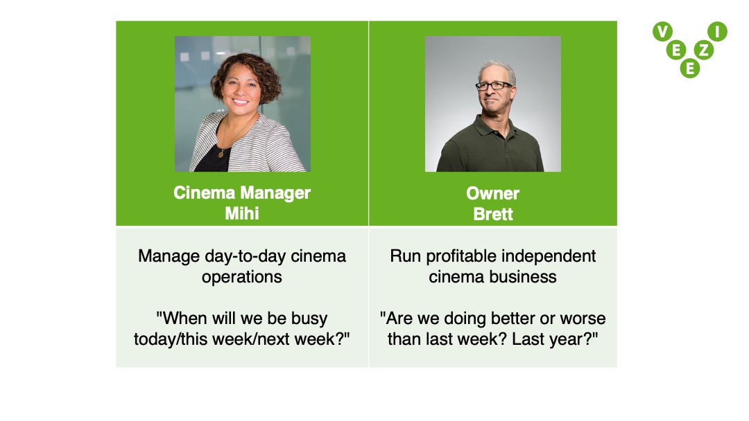
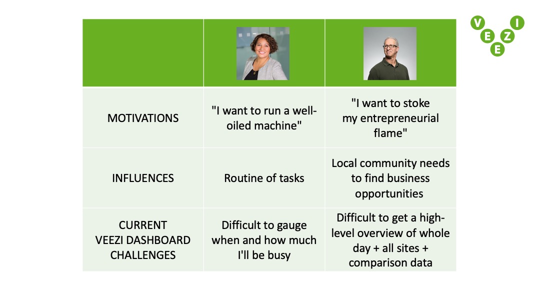
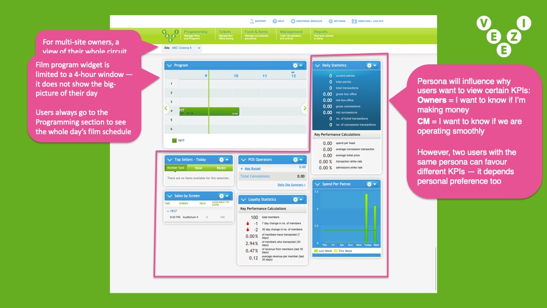
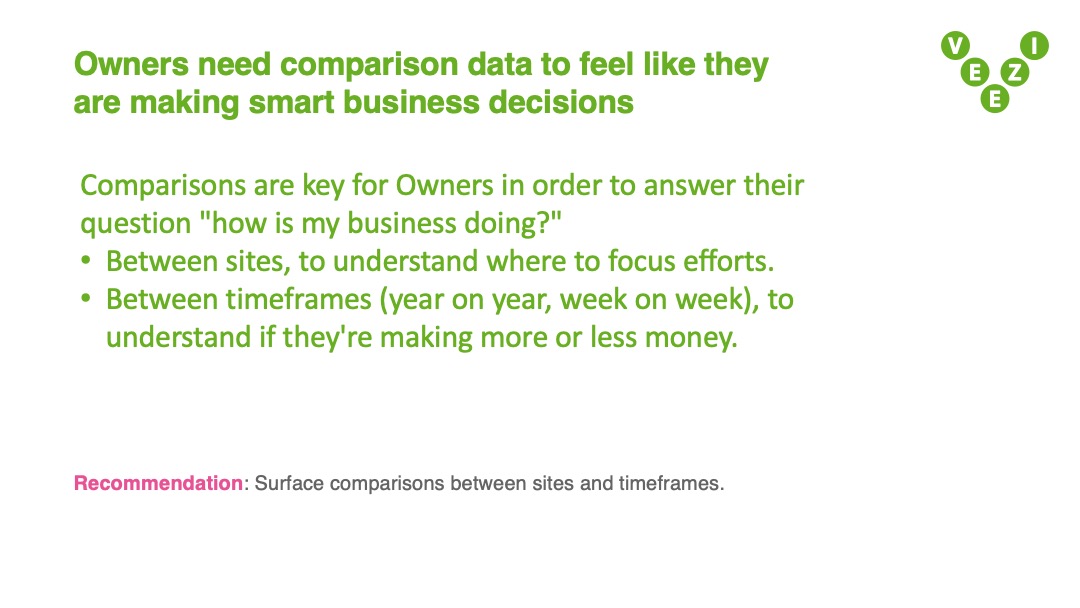
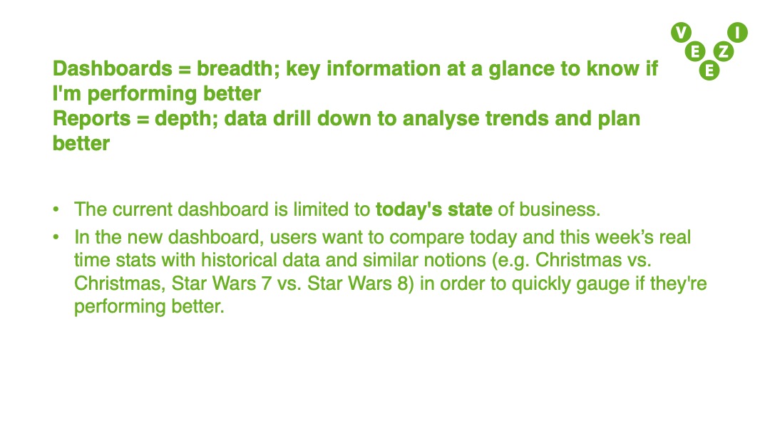
Excerpts from the Veezi dashboard insights report. Authored by myself and the Business Analyst, who acted as my research assistant.
Presented to: Veezi’s Product Director and project sponsor; Chief Product Officer and company founder; Director of Veezi in USA; Operations Manager of Veezi in USA.
Solution
At our presentation of insights, Veezi stakeholders embraced the cinema owner as a distinct archetype. It actually offered a wonderful business opportunity for Veezi. Because this persona is now clearer it’s easier to conceive of product ideas and selling points. Together in this meeting, we agreed the current dashboard can be revised to specifically serve the cinema manager’s needs. The cinema owner needed a completely new view.
As an end-to-end designer, I can lead the user research then execute on my own insights in the UX/UI design. I iterated on both dashboards and validated my designs in follow-up interviews with 3 customers. All were relieved their key painpoints were addressed, and a further wish was expressed: more visual and graphical representations of performance over time.
As an end-to-end designer, I can lead the user research then execute on my own insights in the UX/UI design. I iterated on both dashboards and validated my designs in follow-up interviews with 3 customers. All were relieved their key painpoints were addressed, and a further wish was expressed: more visual and graphical representations of performance over time.
If I’d successfully redesigned a bare minimum dashboard, how should I treat the visualisations to uplift the stakes to a lovable dashboard?
Reflection
This question of a lovable Veezi dashboard is yet to be answered. Further iterating, testing, and development halted when Covid-19 reprioritised Veezi’s projects to ones that might more immediately alleviate our customers.
This project was an unexpected learning of how a single global event can instantly recalibrate entire industries. If the disruption continues for years, social norms will change so much that big problems can be rendered irrelevant. We can try to catch the wave at the right moment, but sometimes it completely knocks you off, and never returns.
This project was an unexpected learning of how a single global event can instantly recalibrate entire industries. If the disruption continues for years, social norms will change so much that big problems can be rendered irrelevant. We can try to catch the wave at the right moment, but sometimes it completely knocks you off, and never returns.


What’s the great big story to tell in ethnographic research?
Focus on communicating the key changes in society, technology, and human behaviour

Summary
RESPONSIBILITIES
Graphic design, Ethnographic research assistance
CONTRIBUTORS
Experience Research Manager, Contract Researcher
View the infographic as a high
resolution PDF︎︎︎
Graphic design, Ethnographic research assistance
CONTRIBUTORS
Experience Research Manager, Contract Researcher
View the infographic as a high
resolution PDF︎︎︎
Objective
The cornerstone research project during my contract at Sky TV NZ was a large scale ethnographic study of New Zealanders’ viewing behaviour. The goal was to update knowledge from the original study done 5 years prior, titled How Do You View (HDYV 2013). How do people view stories? What creates valuable viewing experiences? And what has changed in 5 years?
I was hired for two reasons:
I was hired for two reasons:
- Assist the qualitative researchers as they conduct a diary study and in-person one-on-one interviews, with 28 Kiwis from the 3 most populous New Zealand cities. 10 of whom took part in the first 2013 study
- Translate the resulting insights into an infographic that can be circulated throughout the company
Approach
How Do You View 2018 (HDYV 2018) was commissioned as a 5 year update of its predecessor. Its insights, segmentation frameworks, and terminology has since become the bedrock of all qualitative research from the Consumer Insights team. Keeping this consistency in the newer outputs will emphasise the two as related longitudinal studies, and will also strengthen the relevancy of ethnographic research at Sky TV NZ.
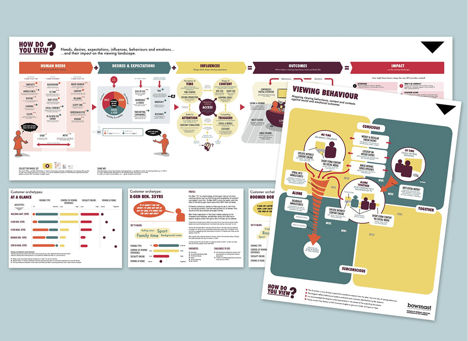
In order to glean what else to carry over for consistency, I studied the original insights infographic designed by design researcher Nick Bowmast.
In researching data visualisations that illustrate numerous changes over time, I stumbled upon the Histomap by John. B Sparks (1931). It made a big impression on me, and was eventually the greatest influence on the look of my infographics.
![Original How Do You View infographics, by Nick Bowmast (2013)]()
![Histomap, by John B. Sparks (1931)]()
In order to glean what else to carry over for consistency, I studied the original insights infographic designed by design researcher Nick Bowmast.
Nick’s layout is the order in which the HDYV 2013 story has been retold at Sky TV NZ. We, the Consumer Insights team, decided keeping the same structure and titles will be great scaffolding for communicating changes from the past 5 years.
In researching data visualisations that illustrate numerous changes over time, I stumbled upon the Histomap by John. B Sparks (1931). It made a big impression on me, and was eventually the greatest influence on the look of my infographics.


After completing field research with 28 participants, the lead researchers wanted a tool to aid their analysis and synthesis process. If they could map each particpant’s “best viewing experience”, the visual transcription can help them compare journeys and people.
To help create the blank map template, I sketched on A4 paper to understand the number of datapoints needed and rough layout of the experience map. I then transposed the design to the visualisation tool most convenient for the researchers — PowerPoint!
Insight
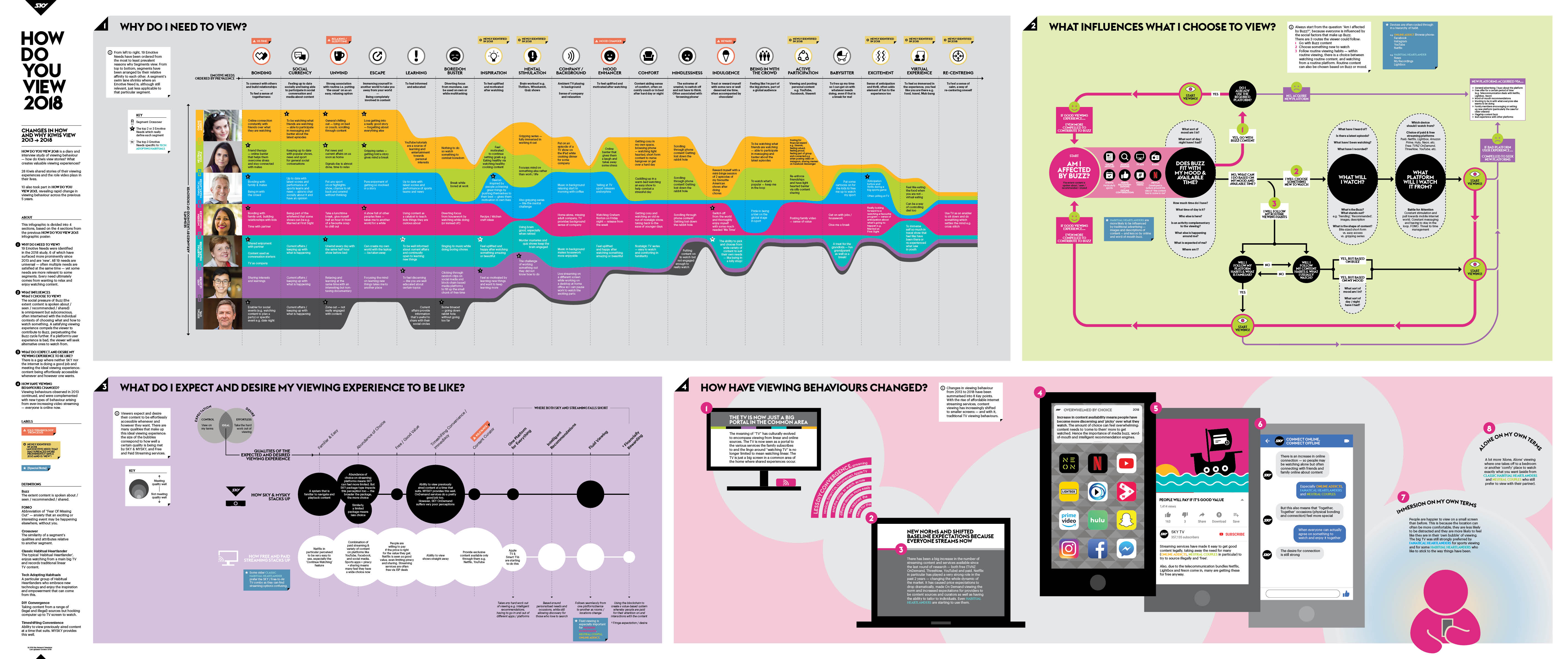
The initial HDYV 2013 key insights poster was divided into 5 sections. I combined and rearranged these based on the importance of the new insights from the 2018 study, to end up with only 4 quadrants.
By treating each quadrant as its own self contained infographic, I could focus on heroing the essence of each


Experiments and iterations of the 4 quadrants of my key insigts infographic. I would seek feedback and validation from the two lead researchers, and design critique from the in-house motion graphics team (graphic design at Sky TV NZ was outsourced).
Solution
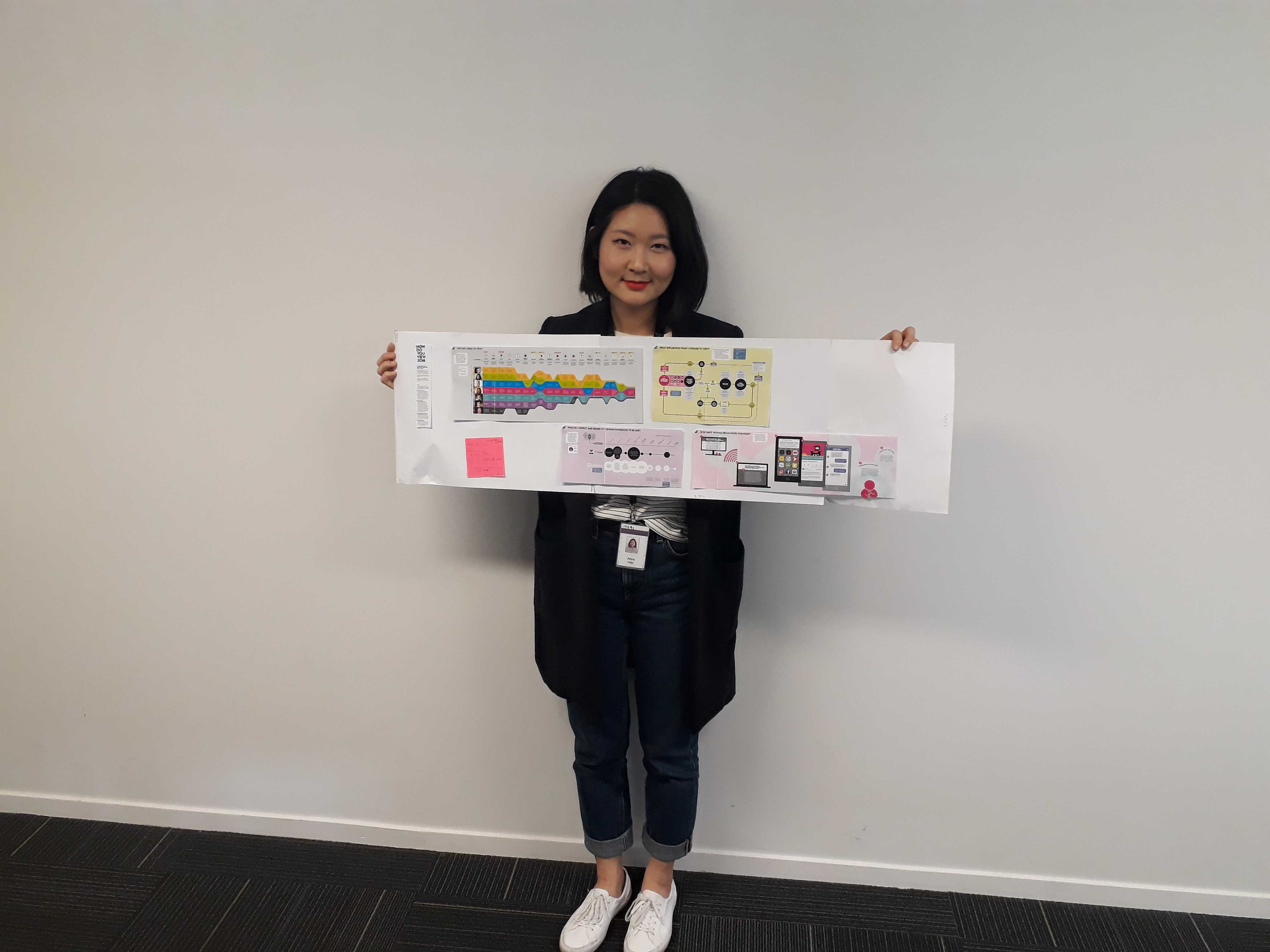
The 4 qudrants of my key insights infographic are:
- Why do I need to view?
This section was centred around the existing 7 customer segments — it’s a focus on people. You can see this quadrant was heavily inspired by the Histomap. The swim lane shrinks and grows based on the segment’s relevance to an emotive need, the most relevant to all being “Bonding”. This visualisation shows the segment Modern Homemaker in a central position because they’re the glue to other segments; almost all identified emotive needs were relevant to Modern Homemakers.
- What influences what I choose to view?
A flowchart of the environmental factors that contribute to the mood a person will want to satiate through content. Now in 2018 there is an overwhelming prevalence of “Buzz”. What’s the most talked about TV shows? Which content grants social currency around the water cooler? At the time of this study Game of Thrones, Westworld, and FIFA World Cup had the biggest Buzz in New Zealand.
- What do I expect and desire my viewing experience to be like?
The bubble chart explains how Sky TV NZ compares to other content platforms. The biggest factor for shifts in expectations were technology: streaming on tablets and smartphones was now the standard. Casting from these devices to the TV was becoming normalised too.
- How have viewing behaviours changed?
In many ways this is the TL;DR of the entire infographic. As a 5 year update, it’s the changes that stakeholders want to know about. I depicted the 10 key changes through a more typical illustration sequence so it reads like a fun picture book.
Reflection
For researchers, the step beyond insights sharing with stakeholders would be insights dissemination to the rest of the organisation: how do you make anything learnable? How do you transition new knowledge to habitual truth? And how do you elicit this buy-in from hundreds of people?
Before my contract ended, the Experience Research Manager and I dreamed of quizzes, tabletop profiles, memes, and giant wall graphics.
However, within one year of HDYV 2018's completion, Sky TV NZ underwent a large restructure and rebranding. My understanding is these research insights are no longer part of their customer experience framework.
The restructure was a teaching moment to me that large, long term initiatives aren’t immune to the changing operational needs of the organisation it serves. I can only hope our work was useful to the incoming team so that they were able to build on top of, rather than redo from scratch.
How can design improve patient experience when up against hospital bureaucracy?
Reimagine your hospital unit as a brand, and let branding principles guide its potential to be lovable
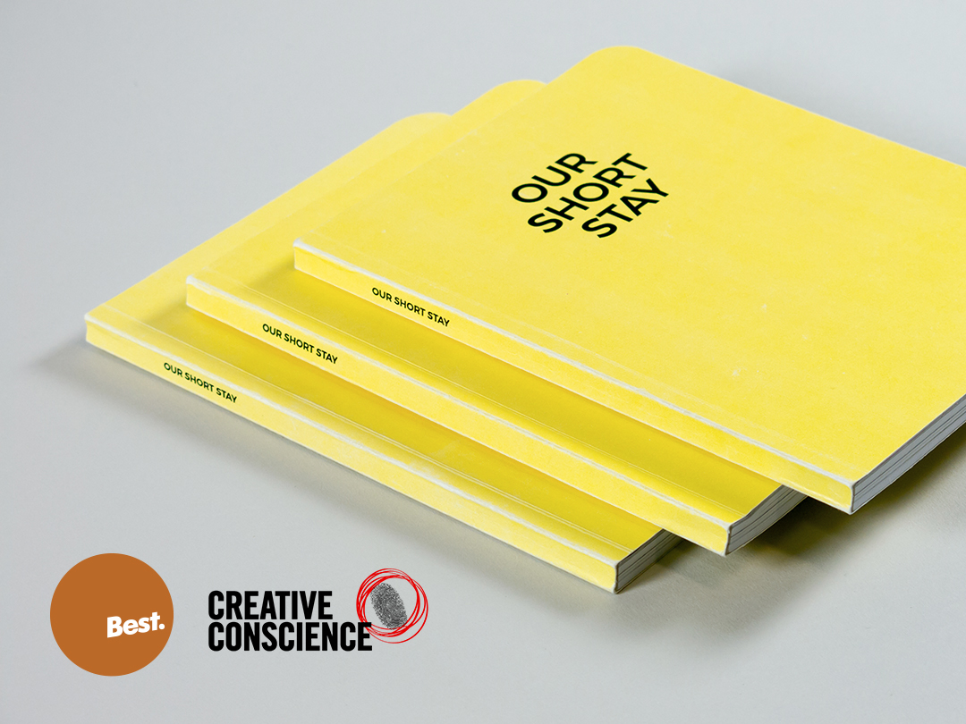
Accolades
Awarded with First Class Honours (from AUT University, New Zealand)
Bronze winner in the Student Public Good category at the 2017 Best Awards (New Zealand)
Highly commended in the Graphics category at the 2017 Creative Conscience Awards (UK)
Bronze winner in the Student Public Good category at the 2017 Best Awards (New Zealand)
Highly commended in the Graphics category at the 2017 Creative Conscience Awards (UK)
Summary
CLIENT
Starship Children’s Health; DHW Lab (New Zealand)
SECTOR
Healthcare; Academia
DURATION
10 month Honours project, 2016
Starship Children’s Health; DHW Lab (New Zealand)
SECTOR
Healthcare; Academia
DURATION
10 month Honours project, 2016
RESPONSIBILITIES
Design research, Academic writing, Graphic design, Infographic design, Experience design thinking, Human centred design, Service design
STAKEHOLDERS
AUT University: Primary and Secondary Postgraduate Supervisors
Starship Children’s Health: Day Stay Unit team
View the exegesis︎︎︎
Design research, Academic writing, Graphic design, Infographic design, Experience design thinking, Human centred design, Service design
STAKEHOLDERS
AUT University: Primary and Secondary Postgraduate Supervisors
Starship Children’s Health: Day Stay Unit team
View the exegesis︎︎︎
Objective
My Honours year project with Starship Children's Health was an open brief with a simple goal: use design to improve the hospital experience for families and patients of the Day Stay Unit (DSU). The project was sponsored by DHW Lab, a joint design studio venture between AUT University and Auckland City Hospital.
Approach
At the project’s start I was a graphic design student with scant exposure to Human Centred Design, User Experience Design, Design Research, etc. Even without adequate knowledge of design thinking methods, it was obvious to me that asking parents and caregivers of DSU patients would be an appropriate way forward. Surely their perspective would point to a worthwhile problem I could focus on. I later learned this techique is called Intercept Interviews. I further supplemented my contextual research with non-participant observations of the DSU waiting area, and expert interviews with appropriate Starship staff.
As I learned about the experiences of DSU patients, parents, and caregivers, I realised this project cannot be solved with a specific design solution. These people were dealing with systemic service delivery problems. No brochure could fix that! So what does it mean to improve someone's experience through design? What can a graphic designer do against the healthcare Wicked Problem?
As I learned about the experiences of DSU patients, parents, and caregivers, I realised this project cannot be solved with a specific design solution. These people were dealing with systemic service delivery problems. No brochure could fix that! So what does it mean to improve someone's experience through design? What can a graphic designer do against the healthcare Wicked Problem?
This turning point evolved my understanding of design application. It’s not just a craft, design can be an analytical and strategic tool. My project was about problem-defining, not problem-solving


Insight
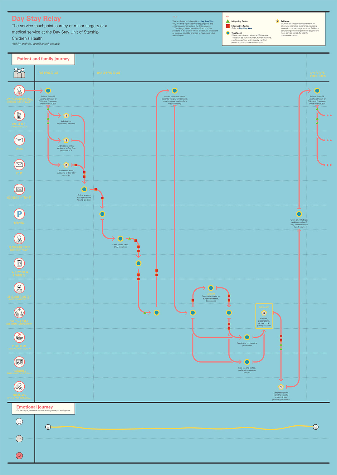
I wanted to present my discovery research findings in an elevated yet approachable way. So I created an A0-sized infographic poster series of DSU processes. I later learned in the world of Service Design, the type of visualisations I created are called Service Blueprints and Touchpoint Journeys. With these visualisations I could clealy see for myself and show others every single touchpoint of the DSU service journey. I wanted to find a problem to focus on, and through crafting these holistic maps, I could see all of them. The problem was the entire journey.
To do my research participants justice, and address the patient journey’s problems at its core, I needed to boldly reimagine the entire DSU journey.

Solution
Human touchpoints of a service experience happen to be the most impactful one for users. The nurses of DSU were beloved, but the other touchpoints were letting down the overall experience and lingering sentiment towards DSU.
Because of my graphic design and creative advertising background, I could see parallels between beloved services and beloved brands. Brands can be loved by its audience if its experience is good, and good brand experiences can be summarised as 3 C’s:
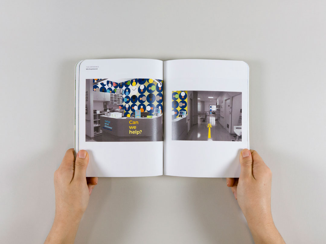
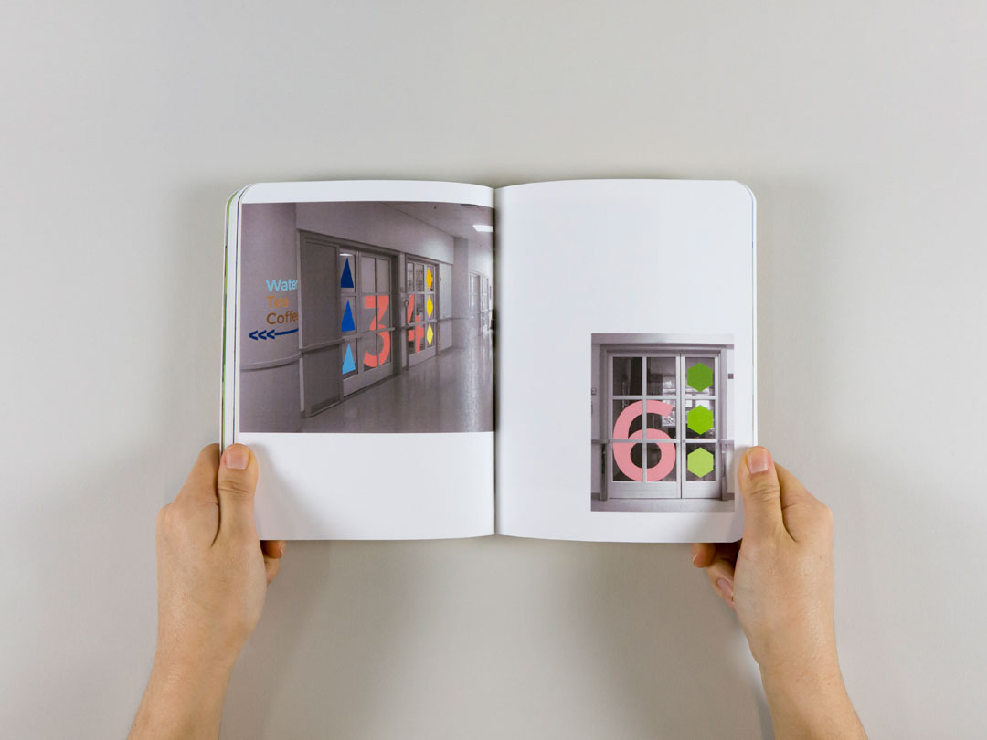
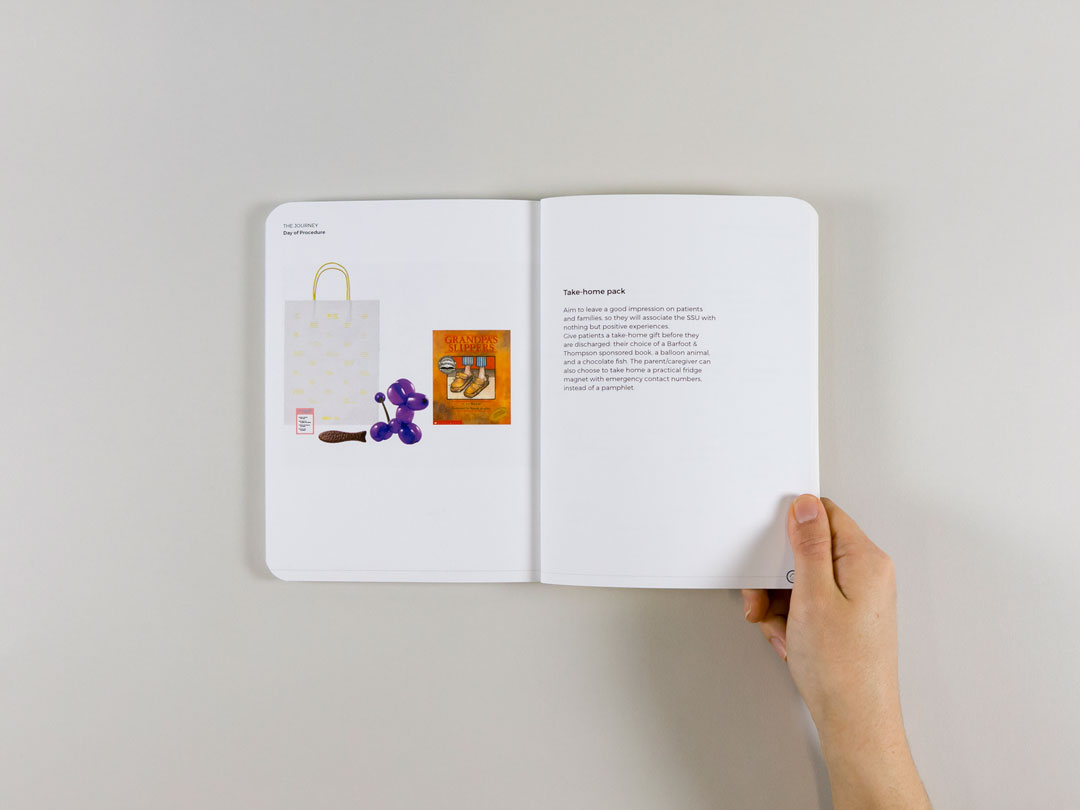
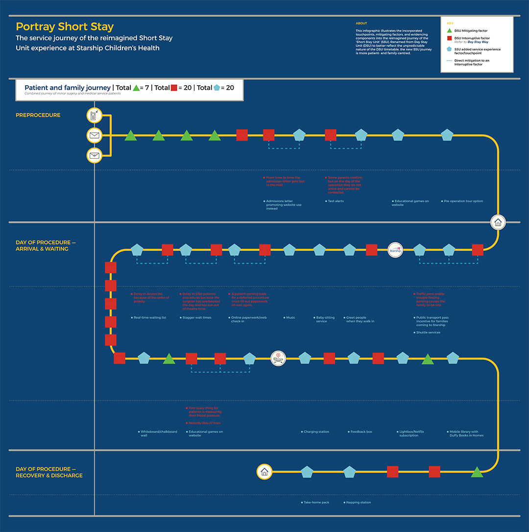
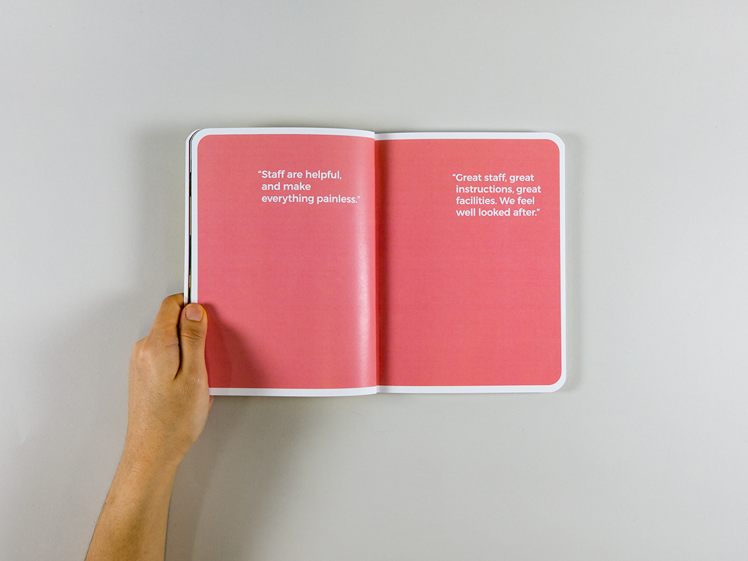
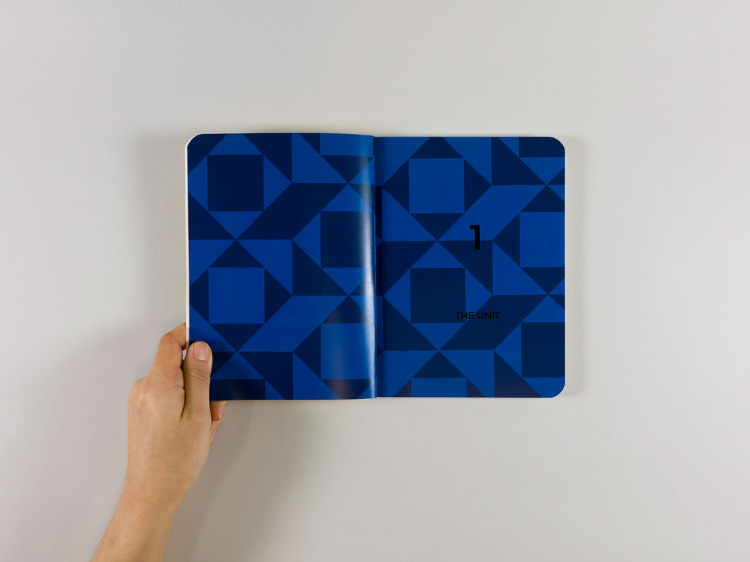
My reimagining propositions the DSU as a brand too. The 3 C’s branding principles guided my new journey’s coherence, credibillity, and consistency. It’s captured through a handbook titled ‘Our Short Stay’. I’ve renamed the Day Stay Unit into Short Stay Unit (SSU) to better reflect the unpredictable nature of the DSU timetable.
![]()
![]()
![]()
![]()
Because of my graphic design and creative advertising background, I could see parallels between beloved services and beloved brands. Brands can be loved by its audience if its experience is good, and good brand experiences can be summarised as 3 C’s:
- Coherent — the whole experience fits together. There are few speed bumps or jarring touchpoints
- Credible — the organisation’s actions and visual communications align with their identity, vision, and values
- Consistent — only through consistency can an organisation establish authenticity and trust
My reimagining propositions the DSU as a brand too. The 3 C’s branding principles guided my new journey’s coherence, credibillity, and consistency. It’s captured through a handbook titled ‘Our Short Stay’. I’ve renamed the Day Stay Unit into Short Stay Unit (SSU) to better reflect the unpredictable nature of the DSU timetable.


Reflection
The factors that contribute to a negative DSU experience are often small, uncontrollable, or caused by the ingrained bureaucratic system. Design may not ever be able to solve these. Instead ‘Our Short Stay’ is an aspirational book that attempts to show design’s potential impact on improving health seekers’ experiences.
This project was awarded with First Class Honours. It’s also a Bronze winner in the Student Public Good category at the 2017 Best Awards, and Highly commended in the Graphics category at the 2017 Creative Conscience Awards.
View the exegesis︎︎︎ and full resolutions of Day Stay Way and Day Stay Relay.
By showing Starship what this reconceptualised experience might look and feel like, we can promote a culture change amongst staff — there are no limits to improving experience when users are championed as the centre.
This project was awarded with First Class Honours. It’s also a Bronze winner in the Student Public Good category at the 2017 Best Awards, and Highly commended in the Graphics category at the 2017 Creative Conscience Awards.
View the exegesis︎︎︎ and full resolutions of Day Stay Way and Day Stay Relay.
