How do you wake up an old New Zealand coffee brand?
User test your redesign early. Communicate the brand identity and value proposition first.
Summary
RESPONSIBILITIES
Responsive web UX design, UI design, User testing
CONTRIBUTORS
Barnes, Catmur & Friends Dentsu: Head of Digital and CX
View the Robert Harris website︎︎︎
Responsive web UX design, UI design, User testing
CONTRIBUTORS
Barnes, Catmur & Friends Dentsu: Head of Digital and CX
View the Robert Harris website︎︎︎
Objective
Robert Harris coffee company was having a brand refresh, and wanted to update its 10+ year old website at the same time. With a new visual identity for inspiration and direction, I was brought in by the Head of Digital and CX to design the UI, create iterative mobile UX prototypes, conduct user tests, and analyse the results to present to stakeholders.
Approach
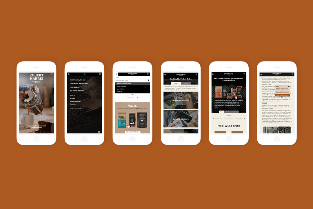
- Mobile-first UX design process to truly upgrade the web experience for the modern day.
- Validate a ‘time-based content principles’ idea through early user testing in its wireframe stage — is it ok if content blocks on the home page automatically shifts its position according to the time of day?
For example: Brew Guides shifts to the top in the morning, Café Locator around lunchtime, Coffee Products in the evening.
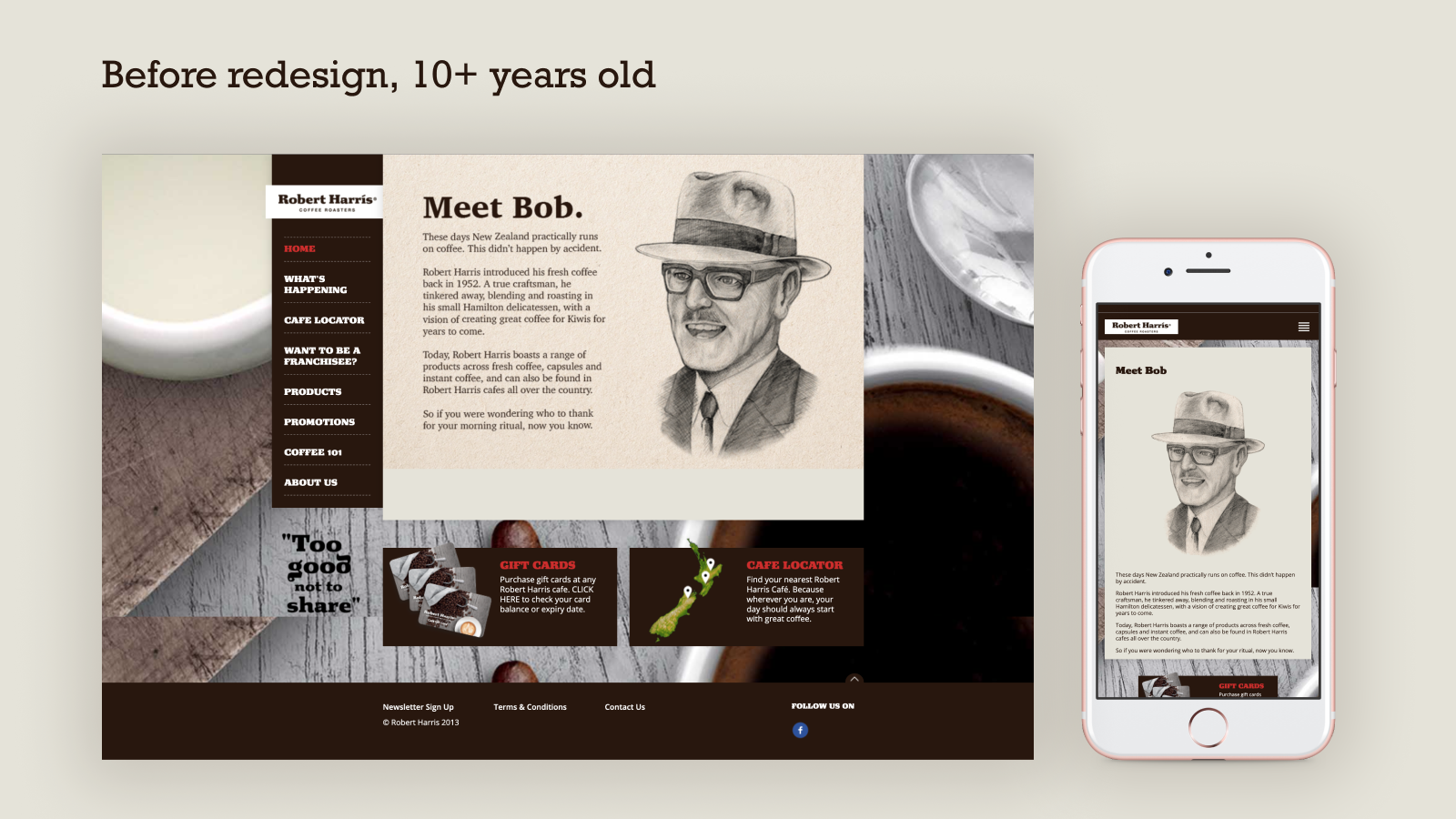
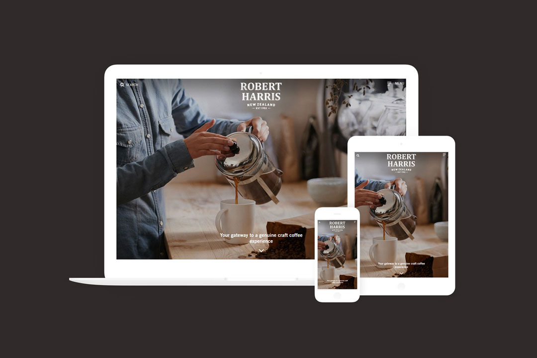
Before Robert Harris’ brand and web design refresh. You can see it was barely responsive — as a 10+ year old website it was never intended to be viewed on mobile.
The old website also prioritised the founder and history. With their new brand positioning, Robert Harris wanted to hero their coffee, coffee culture, and cafe franchisees.
Insight
By quickly user testing wireframes with 10 people around the office, I learned that sections shifting based on time of day didn’t overly bother participants. However, this was a big problem when the section above the fold was shifting around too. When the landing view is constantly changing, Robert Harris loses its moment to express their value proposition, and makes users doubt if they’re on the correct website.
Inconsistent content above the fold of the website would have confused users and undermined the objective of the client’s brief: communicate our brand refresh
Fix to the top a consistent landing section above the fold: strong imagery with a clear brand statement upfront reassures the user they have come to the right place.
View the refreshed Robert Harris website︎︎︎
View the refreshed Robert Harris website︎︎︎