What’s the great big story to tell in ethnographic research?
Focus on communicating the key changes in society, technology, and human behaviour

Summary
RESPONSIBILITIES
Graphic design, Ethnographic research assistance
CONTRIBUTORS
Experience Research Manager, Contract Researcher
View the infographic as a high
resolution PDF︎︎︎
Graphic design, Ethnographic research assistance
CONTRIBUTORS
Experience Research Manager, Contract Researcher
View the infographic as a high
resolution PDF︎︎︎
Objective
The cornerstone research project during my contract at Sky TV NZ was a large scale ethnographic study of New Zealanders’ viewing behaviour. The goal was to update knowledge from the original study done 5 years prior, titled How Do You View (HDYV 2013). How do people view stories? What creates valuable viewing experiences? And what has changed in 5 years?
I was hired for two reasons:
I was hired for two reasons:
- Assist the qualitative researchers as they conduct a diary study and in-person one-on-one interviews, with 28 Kiwis from the 3 most populous New Zealand cities. 10 of whom took part in the first 2013 study
- Translate the resulting insights into an infographic that can be circulated throughout the company
Approach
How Do You View 2018 (HDYV 2018) was commissioned as a 5 year update of its predecessor. Its insights, segmentation frameworks, and terminology has since become the bedrock of all qualitative research from the Consumer Insights team. Keeping this consistency in the newer outputs will emphasise the two as related longitudinal studies, and will also strengthen the relevancy of ethnographic research at Sky TV NZ.
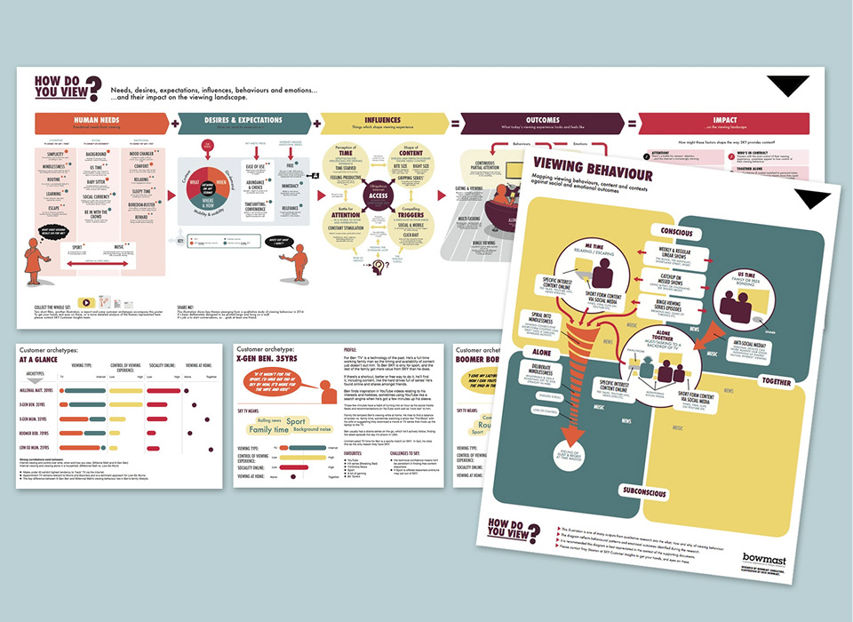
In order to glean what else to carry over for consistency, I studied the original insights infographic designed by design researcher Nick Bowmast.
In researching data visualisations that illustrate numerous changes over time, I stumbled upon the Histomap by John. B Sparks (1931). It made a big impression on me, and was eventually the greatest influence on the look of my infographics.
![Original How Do You View infographics, by Nick Bowmast (2013)]()
![Histomap, by John B. Sparks (1931)]()
In order to glean what else to carry over for consistency, I studied the original insights infographic designed by design researcher Nick Bowmast.
Nick’s layout is the order in which the HDYV 2013 story has been retold at Sky TV NZ. We, the Consumer Insights team, decided keeping the same structure and titles will be great scaffolding for communicating changes from the past 5 years.
In researching data visualisations that illustrate numerous changes over time, I stumbled upon the Histomap by John. B Sparks (1931). It made a big impression on me, and was eventually the greatest influence on the look of my infographics.


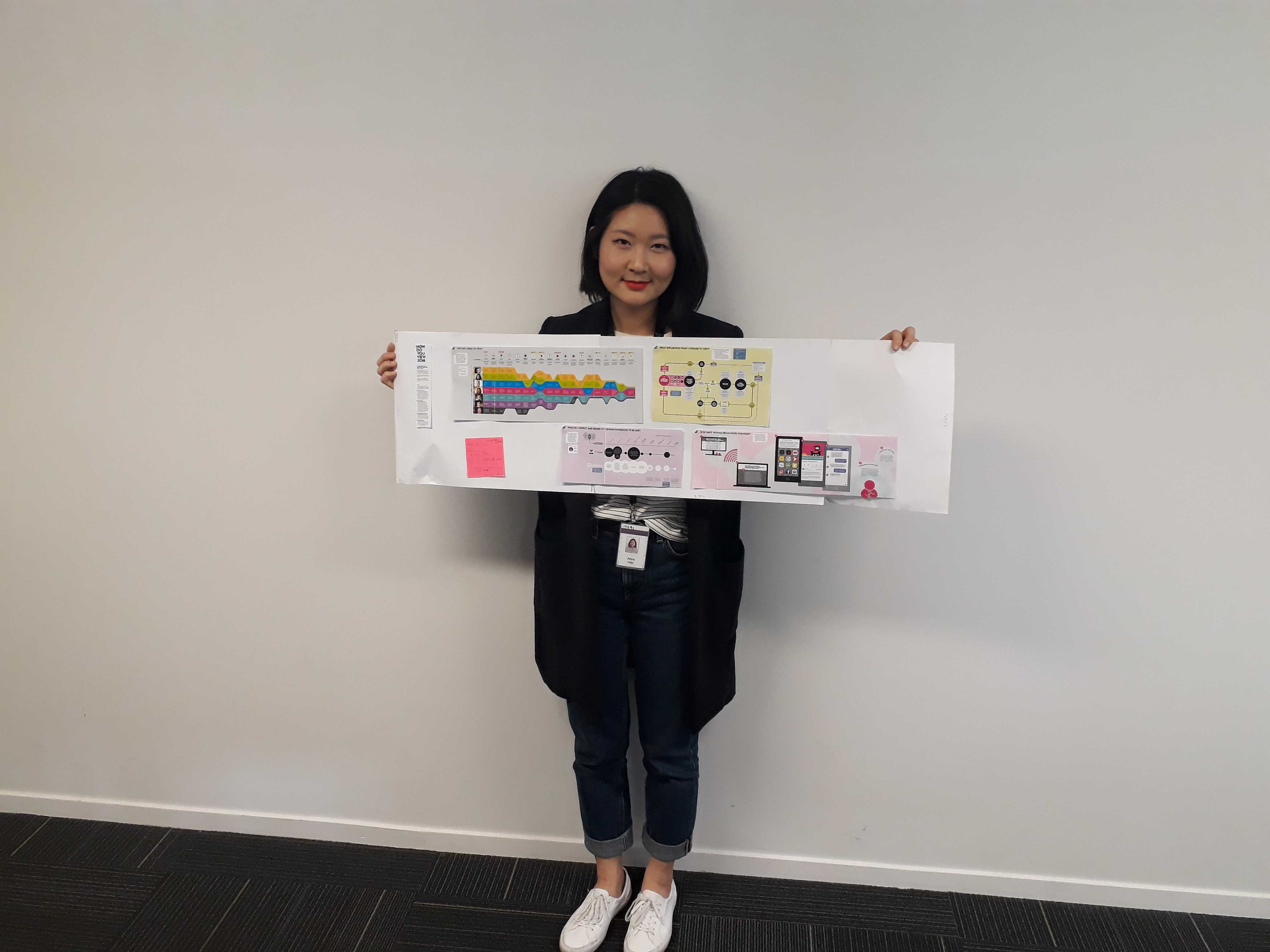
After completing field research with 28 participants, the lead researchers wanted a tool to aid their analysis and synthesis process. If they could map each particpant’s “best viewing experience”, the visual transcription can help them compare journeys and people.
To help create the blank map template, I sketched on A4 paper to understand the number of datapoints needed and rough layout of the experience map. I then transposed the design to the visualisation tool most convenient for the researchers — PowerPoint!
Insight
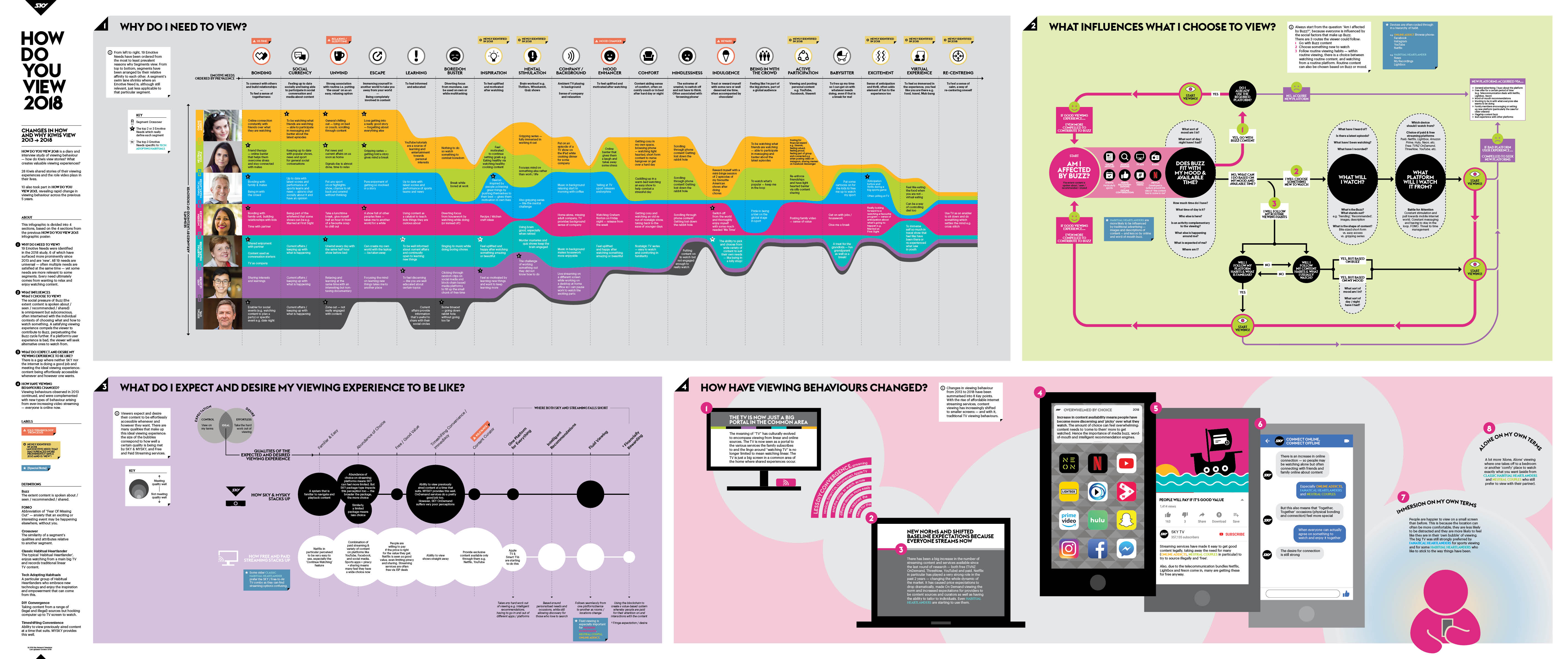
The initial HDYV 2013 key insights poster was divided into 5 sections. I combined and rearranged these based on the importance of the new insights from the 2018 study, to end up with only 4 quadrants.
By treating each quadrant as its own self contained infographic, I could focus on heroing the essence of each


Experiments and iterations of the 4 quadrants of my key insigts infographic. I would seek feedback and validation from the two lead researchers, and design critique from the in-house motion graphics team (graphic design at Sky TV NZ was outsourced).
Solution
The 4 qudrants of my key insights infographic are:
- Why do I need to view?
This section was centred around the existing 7 customer segments — it’s a focus on people. You can see this quadrant was heavily inspired by the Histomap. The swim lane shrinks and grows based on the segment’s relevance to an emotive need, the most relevant to all being “Bonding”. This visualisation shows the segment Modern Homemaker in a central position because they’re the glue to other segments; almost all identified emotive needs were relevant to Modern Homemakers.
- What influences what I choose to view?
A flowchart of the environmental factors that contribute to the mood a person will want to satiate through content. Now in 2018 there is an overwhelming prevalence of “Buzz”. What’s the most talked about TV shows? Which content grants social currency around the water cooler? At the time of this study Game of Thrones, Westworld, and FIFA World Cup had the biggest Buzz in New Zealand.
- What do I expect and desire my viewing experience to be like?
The bubble chart explains how Sky TV NZ compares to other content platforms. The biggest factor for shifts in expectations were technology: streaming on tablets and smartphones was now the standard. Casting from these devices to the TV was becoming normalised too.
- How have viewing behaviours changed?
In many ways this is the TL;DR of the entire infographic. As a 5 year update, it’s the changes that stakeholders want to know about. I depicted the 10 key changes through a more typical illustration sequence so it reads like a fun picture book.
Reflection
For researchers, the step beyond insights sharing with stakeholders would be insights dissemination to the rest of the organisation: how do you make anything learnable? How do you transition new knowledge to habitual truth? And how do you elicit this buy-in from hundreds of people?
Before my contract ended, the Experience Research Manager and I dreamed of quizzes, tabletop profiles, memes, and giant wall graphics.
However, within one year of HDYV 2018's completion, Sky TV NZ underwent a large restructure and rebranding. My understanding is these research insights are no longer part of their customer experience framework.
The restructure was a teaching moment to me that large, long term initiatives aren’t immune to the changing operational needs of the organisation it serves. I can only hope our work was useful to the incoming team so that they were able to build on top of, rather than redo from scratch.


